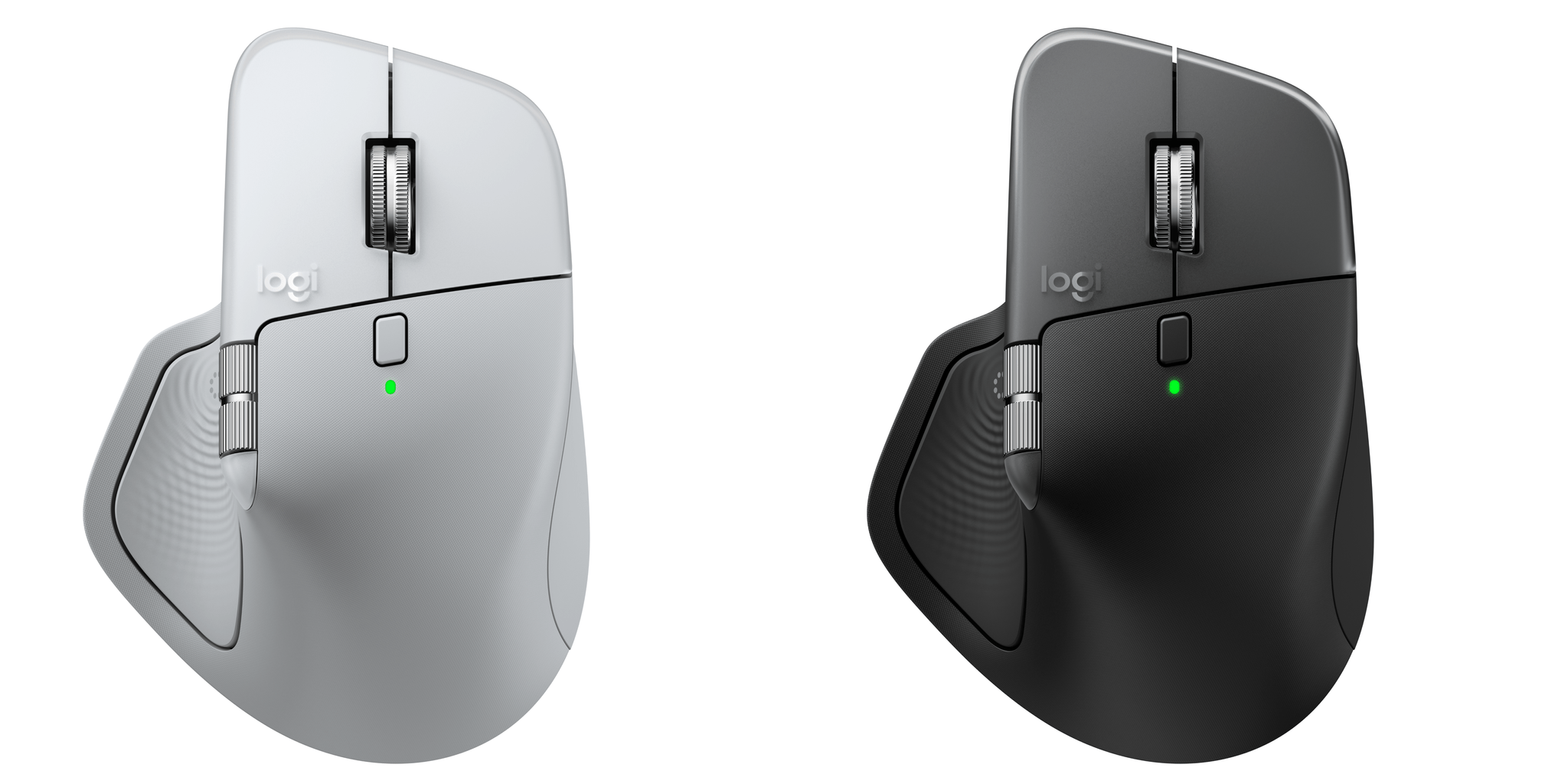
Today, Logitech introduced an updated version of its MX Master series mouse dubbed the MX Master 4. It’s a good upgrade, but the changes are largely incremental; while I like it a lot, the MX Master 4 won’t be for everyone. Logitech sent me the MX Master 4 to try, and I’ve been using it for the past couple of weeks, so I thought I would share what the experience has been like so far.
Posts in reviews
First Look: Logitech’s MX Master 4 Adds Haptics, Actions Ring, and a USB-C Bolt Receiver
Tot 2.0: A Thoughtful Extension of an Already Elegant Note-Taking App
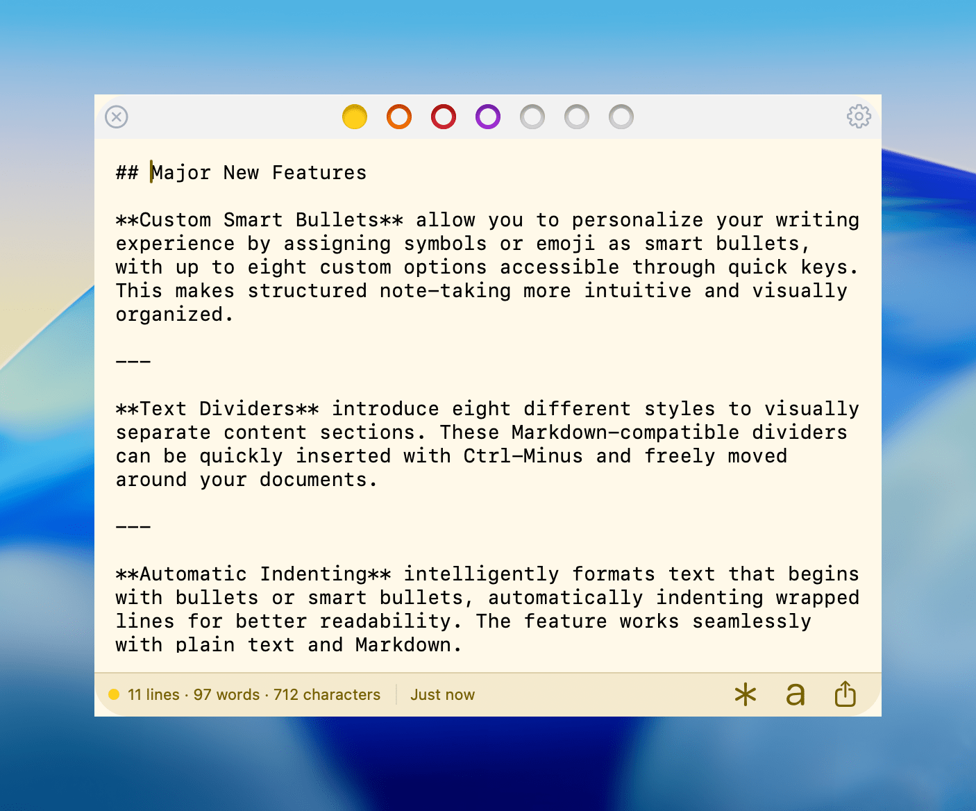
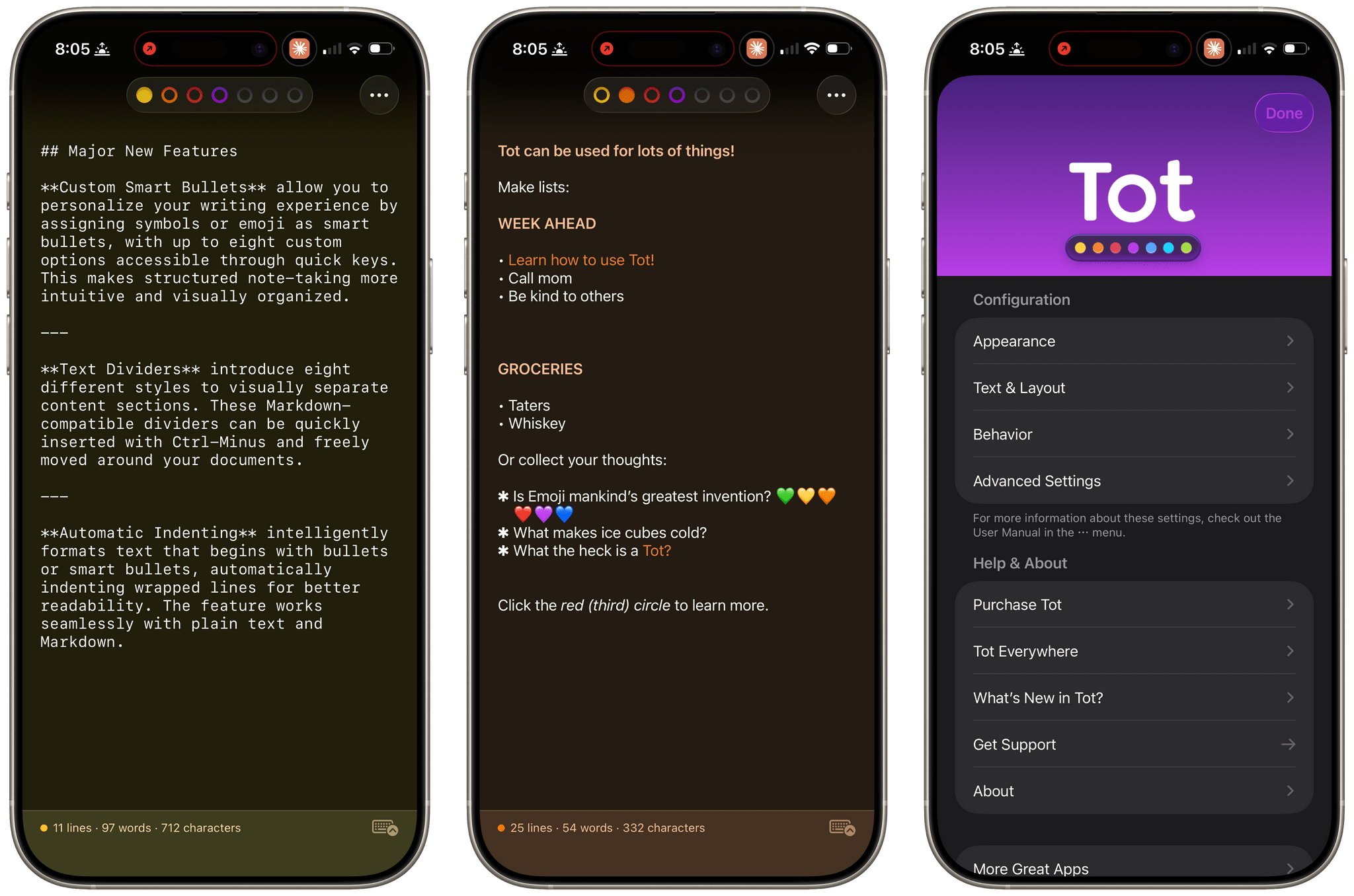
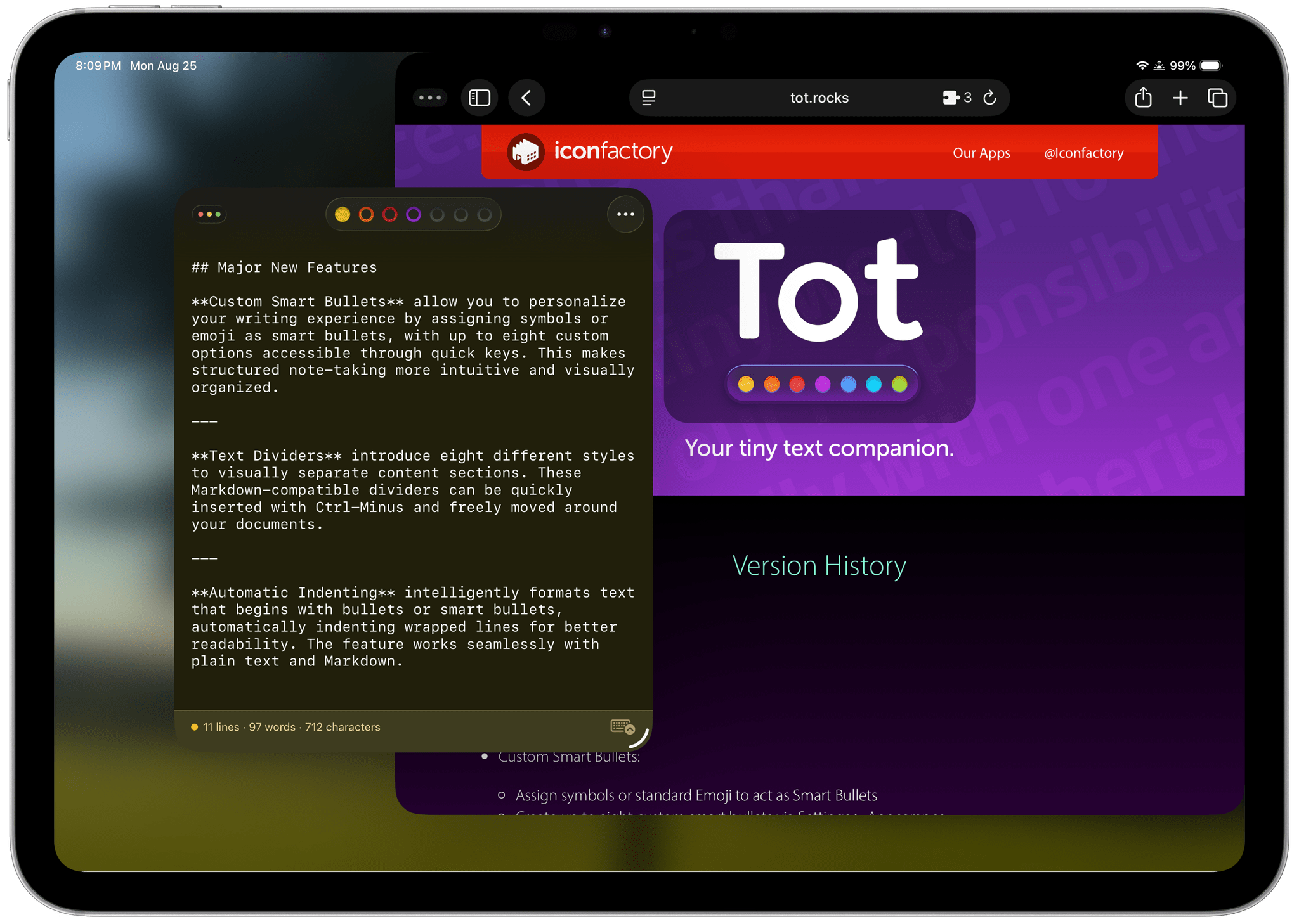
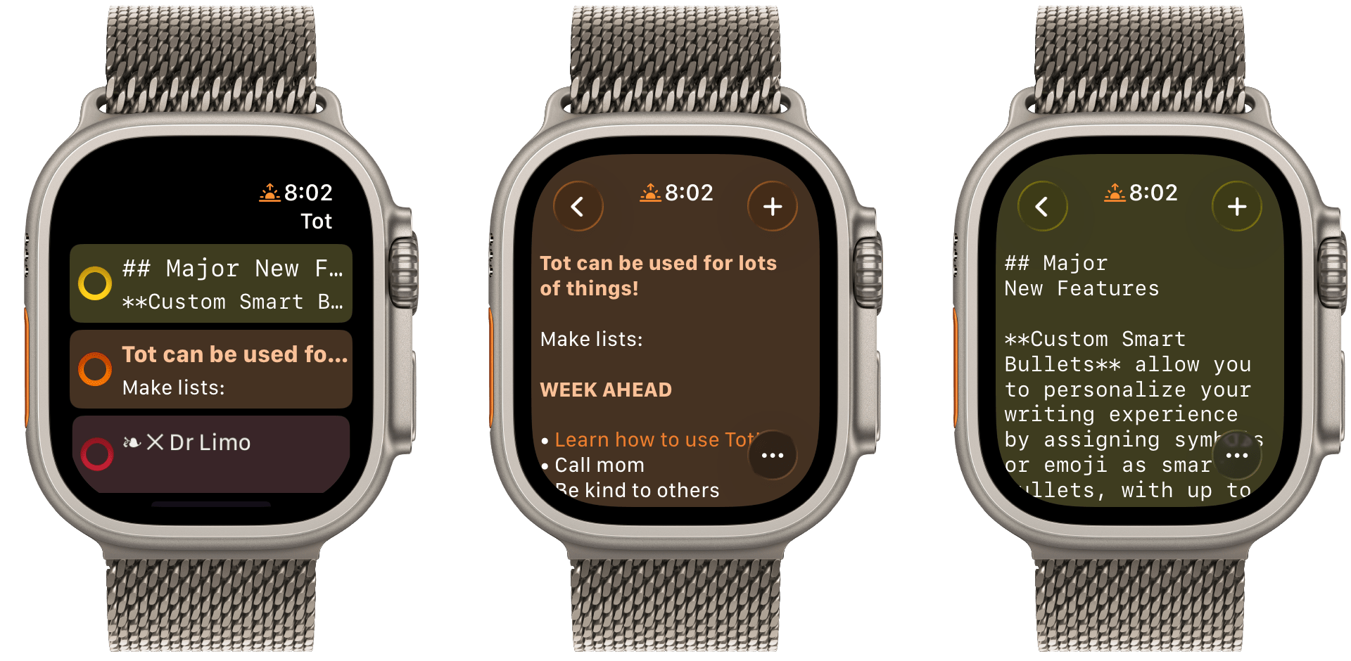
Late yesterday, The Iconfactory released 2.0 updates to Tot for macOS, Tot Pocket for iOS and iPadOS, and Tot Mini for watchOS. The apps, which The Iconfactory describes as tiny text companions, include a handful of big new features that span all three versions, along with other updates and fixes that are unique to each platform.
What hasn’t changed is Tot’s incredible design and reliable performance across all platforms. The app showcases some of The Iconfactory’s best app design work, which Federico described in his review of version 1.0:
Tot’s colored dots serve the dual purpose of being spatial navigation tool and context indicators. You can navigate across documents in the app with a quick swipe, and in doing so on modern iPhones you’ll feel a delightful haptic tap; alternatively, you can tap the dots to switch documents. As I mentioned above, each dot carries a color, which becomes the background color of the selected document (vibrancy is also used to let the color shine through the software keyboard – a nice touch). The palette chosen by The Iconfactory for Tot’s seven documents is some of the finest selection of colors I’ve seen in a modern iOS app: it looks great in light mode, and it looks amazing in dark mode thanks to its combination of high contrast and translucency.
The combination of that elegant design with reliable sync across multiple OSes and thoughtful Shortcuts integration has understandably made the Tot family of apps integral to a lot of MacStories readers’ workflows. However, if you haven’t tried any of the Tot apps before, it’s worth checking out Federico’s review of version 1.0 for the fundamentals because they haven’t changed, and I’ll be focusing on what’s new.
My favorite 2.0 feature is that Tot now supports automatic indenting. If you indent a line using the Tab key, the next line will begin at the same indentation level when you hit Return. That makes creating hierarchical lists a lot faster than before. My only quibble with the feature is that if you’re making a bulleted list, to indent a line, you can’t indent using just the Tab key if the cursor appears anywhere in your line of text. However, you can use ⌘ + ] and ⌘ + ] to do the same thing. Regardless of how indenting is invoked, it’s an excellent addition to Tot that I was glad to see included in the update.
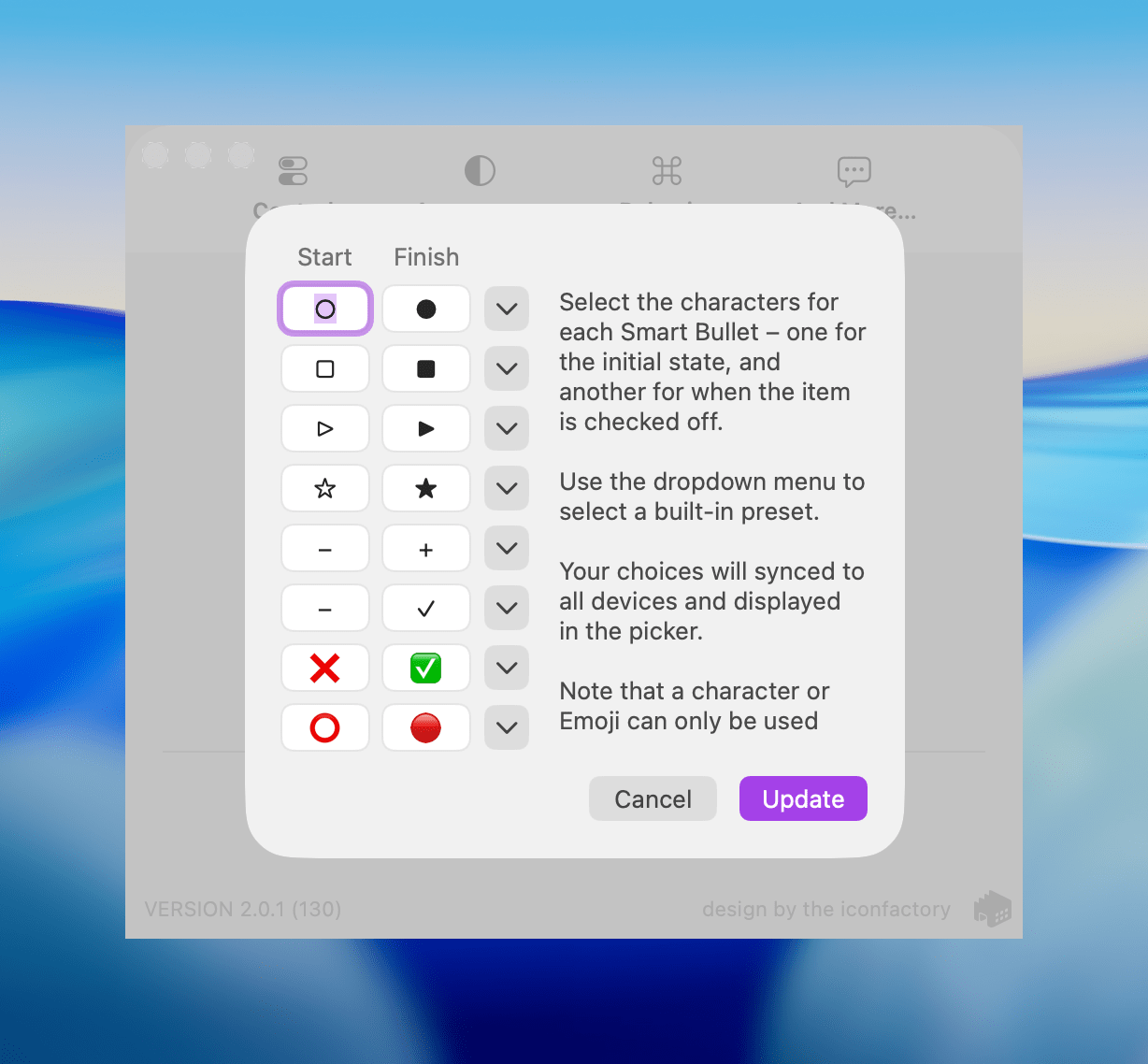
Speaking of bullets, Tot 2.0 also supports customizable smart bullets. From the app’s settings, you can choose from different pairs of symbols and emoji, like empty and filled circles or empty and filled stars. To toggle between the symbols in each pair, all you need to do is click or tap on them. If the eight default pairs aren’t to your taste, there are a bunch of alternatives you can use instead, such as the snowflake and flame emoji. It’s a clever twist on standard checkboxes and radio buttons that I’ve enjoyed because it adds some character and color to the app.
Tot adds eight new text dividers, too. From the classic three dashes used in Markdown to asterisks and more, there’s a nice variety of options. Plus, you can easily insert a divider with the keyboard shortcut Control + Minus.
The Iconfactory has made other platform-specific changes, too:
- Settings have been redesigned in the Mac version and include new options, such as floating the Tot window over other windows.
- The iOS and iPadOS versions include a menu button that offers access to the app’s settings along with a couple of bulk operations like saving, sharing, and exporting notes.
- The watch app’s design has been refreshed with simplified controls and colorful backgrounds.
It’s great to see the Tot apps reach version 2.0. The three tentpole features – automatic indenting, custom smart bullets, and text dividers – are all meaningful improvements that don’t compromise the apps’ simplicity. Those features, along with several quality of life improvements and other bug fixes that you can read about in Tot’s version history, add up to an excellent update that should serve users well for a long time.
Tot is available on the Mac App Store, and Tot Pocket is available on the iOS and iPadOS App Store. Each costs $19.99, though existing users can update to Tot Pocket at no extra cost. Tot Mini, the Apple Watch app, is available as a separate $1.99 purchase.
One Month with the Aqara G410 Video Doorbell
Last month, after an advanced preview at CES back in January, Aqara released an update to its G4 smart video doorbell dubbed the Doorbell Camera Hub G410 Select. I had been keeping my eye out for this release ever since its announcement, and it just so happened to coincide with the passing of my existing smart doorbell from Netatmo. That was more than enough reason to purchase the G410, and over a month of daily usage, I’ve been enjoying several of the camera’s excellent new features while also wishing for some improvements in other areas.
Philips Hue Adds Flexibility to the Play Line with New Wall Washer Lights
For the past couple of weeks, I’ve been testing a pair of Philips Hue Play wall washer lights along with a Play HDMI sync box 8K that the company sent me to test. The wall washer lights are a new and interesting approach to accent lighting for the Hue Play line that I like a lot, but they also come with a premium price tag, so it’s worth taking a close look at what they offer.
I’ve been using Philips Hue Play lights for a while. I have two Play gradient light tubes in my office; one sits behind a shelf on my desk, providing a backlight to my work environment, while the other is on the top of a tall bookshelf, illuminating what would otherwise be a dark corner of the room. I typically set them to a natural light color using Adaptive Lighting in Apple’s Home app, but they can do fancy gradient colors, too, which can be a fun way to mix things up.
But the downside of tube lights is that they take up a lot of horizontal space. That’s where the new wall washer lights come in. They’re cylindrical with a vertical and angled slice taken out of one side, which is where the LEDs are located. Most notably, though, at around six inches tall by a little more than three inches wide, the wall washers work in a much wider variety of places than tube lights. That compact footprint has been perfect for fitting behind my TV, where I’ve already crammed gaming consoles, a Wi-Fi router, and other gear.
Other highlights of the Hue Play wall washers include:
- ColorCast, Philips Hue’s term for the way the wall washers generate highly saturated multi-colored gradients,
- 1035 lumens of light, which is impressive for such a small device, and
- the ability to display white light in a wide 2000–6500 Kelvin range.
The Play wall washers require a Hue Bridge and are compatible with HomeKit, allowing you to use either the Hue app or the Home app to turn them on and off, dim them, and change their colors.
Cassette: A Video Time Machine
Devin Davies, the developer of Crouton whom Federico and I interviewed after he won an Apple Design Award in 2024, has released a new app called Cassette. It’s an app for browsing videos from the photo library on your iPhone or iPad that has a fun design twist.
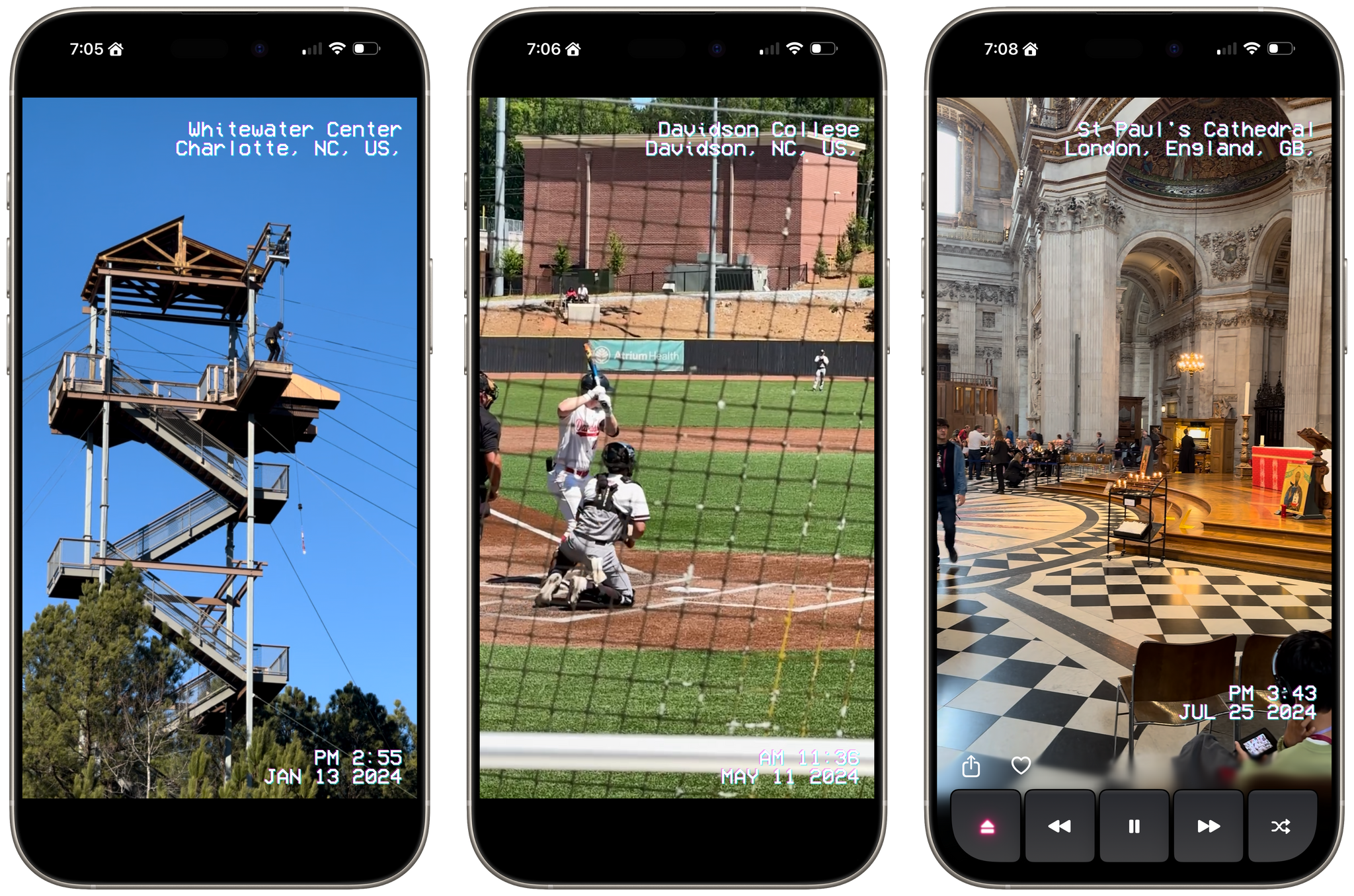
Leaning heavily into the nostalgia of watching old videos of friends and family, Cassette sorts your videos using a VCR metaphor. Videos are organized by year and by collection, with video cassette art and a label identifying each. At the top of the screen is an old CRT TV with a built-in VCR. Tap a year or collection, and it loads into the TV with satisfying haptic feedback on the iPhone.
Tap the virtual TV, and the video goes full-screen with date and location data that’s reminiscent of a VCR’s UI. While watching videos, the app offers standard playback controls along with a shuffle button, buttons to share and favorite videos, and an eject button to return to your video collections.
Videos cycle from one to the next and then loop back to the beginning, where playback continues. You can also swipe through videos TikTok-style, skipping over any you don’t want to watch. Finally, there’s a ‘Take Me Somewhere’ button at the bottom that drops you at a random location in your video collection, eliminating the need to pick something yourself.
Most of the functionality found in Cassette is available in other video players, but that doesn’t make it any less fun or delightful. What sets the app apart is its focus on design and framing. From the drop, Cassette is designed to transport you to the past with its VCR-inspired UI and singular focus on videos, transforming into a sort of handheld time machine.
Cassette is available on the App Store as a free download. Certain features are only available via a $0.99/month or $5.99/year subscription or a $7.99 one-time payment.
Folio: A Promising Read-Later App with a Strong Foundation
I’ve been using read-it-later apps since before I had an iPhone. For those of us who were Wi-Fi-only iPod touch users before owning iPhones, apps like Instapaper were great for reading on the go.
Like in those early days, the read-later universe is once again hyper-competitive, with a lot of relatively new entrants such as Matter and Readwise Reader. That’s led to other apps shutting down. ElevenLabs bought and closed Omnivore, and most recently, Pocket, which debuted ages ago as Read It Later and was eventually acquired by Mozilla, shuttered.
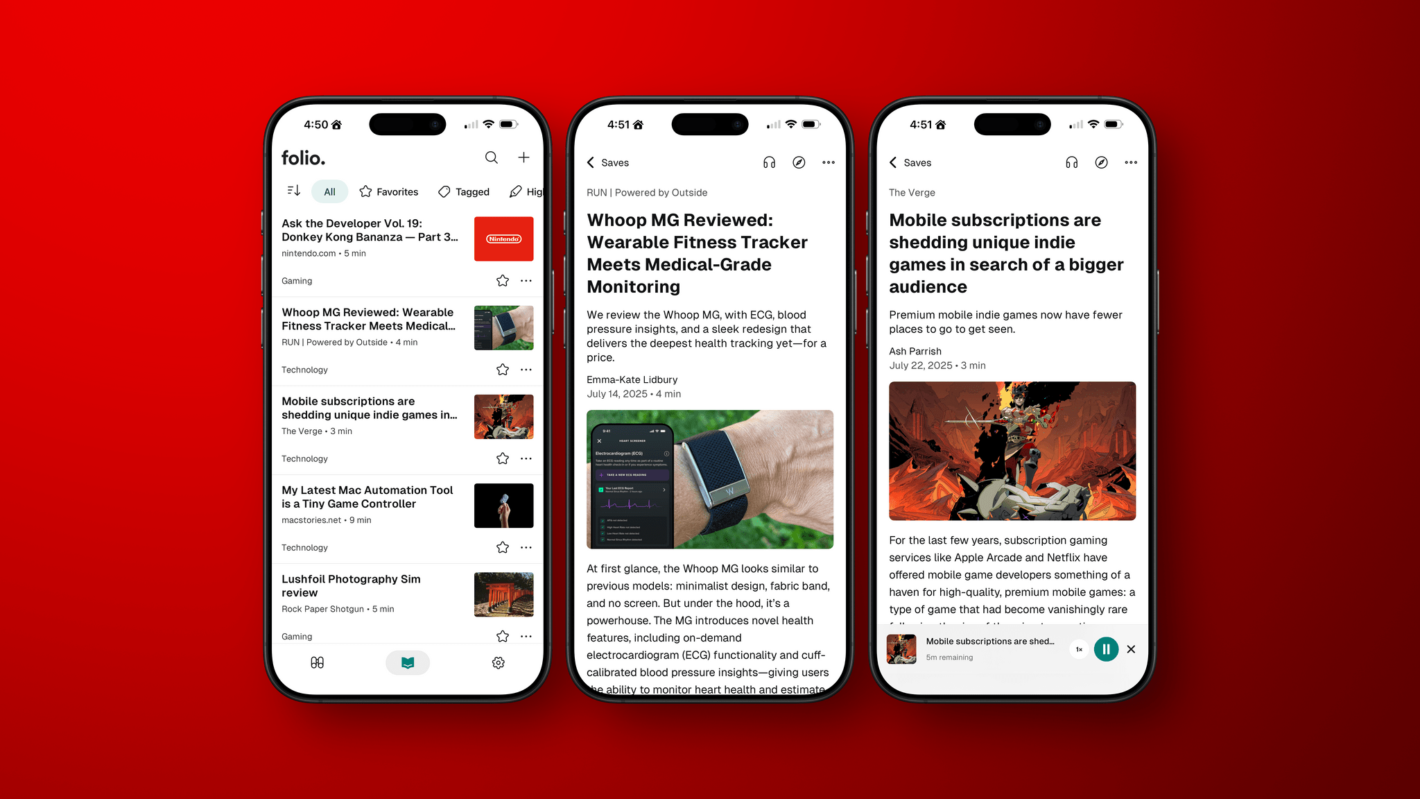
In the wake of Pocket’s demise, Nick Chapman, who used to work on Pocket, and the team at Less is Better debuted Folio, a new read-later app for the iPhone, the iPad, Android, and the web that they say is designed to capture the essence of Pocket. I used Pocket on and off over the years but always considered it a step behind alternatives, so my expectations for Folio weren’t high.
Still, I was curious to see what Folio had to offer, especially because it must have been put together very quickly in order to be launched as Pocket shut down. Despite my initial reservations and some gaps in the app’s functionality, the Folio team has laid a great foundation with an excellent reading experience that’s worth keeping an eye on.
Longplay for Mac Launches with Powerful AI and Shortcuts Integration
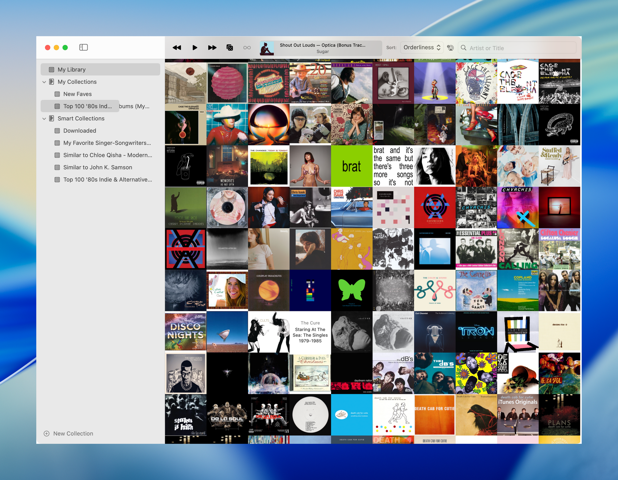
Longplay by Adrian Schönig is an excellent album-oriented music app that integrates with Apple Music. The app started on iOS and iPadOS, then later added support for visionOS. With today’s update, Longplay is available on macOS, too, where it adds unique automation features.
If you aren’t familiar with Longplay, be sure to check out my reviews of version 2.0 for iOS and iPadOS and the app’s debut on the Vision Pro. I love the app’s album art-forward design, collection and queuing systems for navigating and organizing large music libraries, and many other ways to sort, filter, and rediscover your favorite albums. Here’s how Adrian describes Longplay in a post introducing the Mac version:
It filters out the albums where you only have a handful of tracks, and focusses on those complete or nearly complete albums in your library instead. It analyses your album stats to help you rediscover forgotten favourites and explore your library in different ways. You can organise your albums into collections, including smart ones. And you can go deep with automation support.
With the introduction of Longplay for Mac, the app is now available everywhere, with feature parity across all versions. Plus, Longplay syncs across all devices, so your Collections and Smart Collections are available on every platform.
Logitech’s Flip Folio: A Modular iPad Keyboard for Occasional Typing
Shortly before WWDC, Logitech sent me their brand new Flip Folio case/keyboard combo to test. It’s a cleverly designed iPad case that’s a bit heavy but has a lot of other things going for it, like a very stable kickstand and an excellent travel keyboard. The Flip Folio is also more affordable than the Apple Magic Keyboard, which I expect will make it an attractive option for many iPad users.
Framous 1.2: An Indispensable Screenshot Utility
For a long time, the go-to method for quickly framing a screenshot taken on an Apple device was Federico’s excellent Apple Frames shortcut. Iterating on it each year, he even added an API for expanded customization. It’s still a terrific way to create a device-framed screenshot in a pinch, but due to the limitations of Shortcuts, you can’t manually adjust the layout of multiple screenshots or their output sizes.
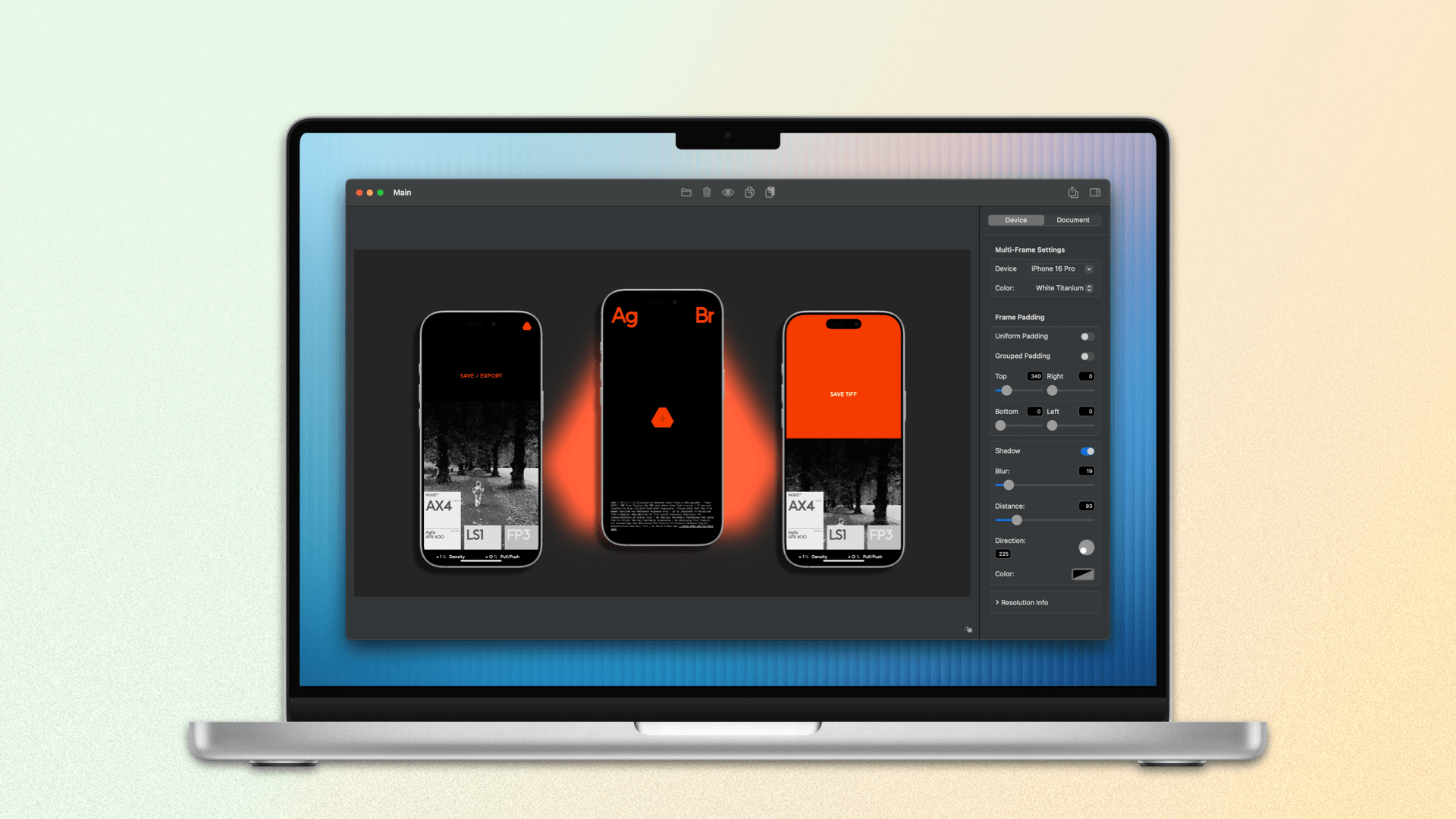
Within the last year, not just one, but two well-made screenshot-framing apps have come on the scene. The first was Shareshot for iPhone, iPad, Vision Pro, and, more recently, Mac. John reviewed Shareshot in August of last year and came away impressed, but with a few reservations. In February, Dark Noise developer Charlie Chapman released his take on this new kind of app with Framous for macOS. At launch, the app showed promise but lacked a lot of features that I and many others desired. Version 1.2, available now, is a stacked release that adds a vast number of requested capabilities and customizations. Let’s take a look.


