Posts in stories

iPhone 17 Pro Max: The First Three Days

Last Friday, just before midday, my new iPhone 17 Pro Max arrived at my home – a Deep Blue model with 512 GB of storage. Since then, it’s dropped neatly into my daily iPhone routine. In many ways, it’s not that different from the iPhone 16 Pro Max that I’ll be trading in. I’ve been on iOS 26 for months, so the operating system isn’t a big change, but there are some notable differences that I thought I’d share.

Setup

This year’s setup process was smoother than usual. I was in a rush to set up my iPhone because it arrived at about 11:30 AM and Federico and I were planning to record this week’s episode of AppStories all about our hardware first impressions. Given time differences, that didn’t leave me much time to get up and running.

I decided to go with restoring from an iCloud backup, which gets your iPhone to a usable state faster than other options but can take a long time to download all of your apps. It was a good call because by the time we started recording about 45 minutes later, not only did I have access to the basics, but most of the apps assigned to active Home screens had already been downloaded, giving me a chance to play around with things a bit before recording.

I had plans to go out late in the afternoon and was hoping to get as much of the transfer finished by then as possible, so I connected my iPhone 17 Pro Max to an Ethernet adapter and let it do its thing. When I left the house around 4:00 PM, I was pleasantly surprised to find that nearly all of the 520 apps I had installed were already downloaded.

Heat

The 17 Pro Max dissipates heat with the help of a vapor chamber.

The 17 Pro Max dissipates heat with the help of a vapor chamber.

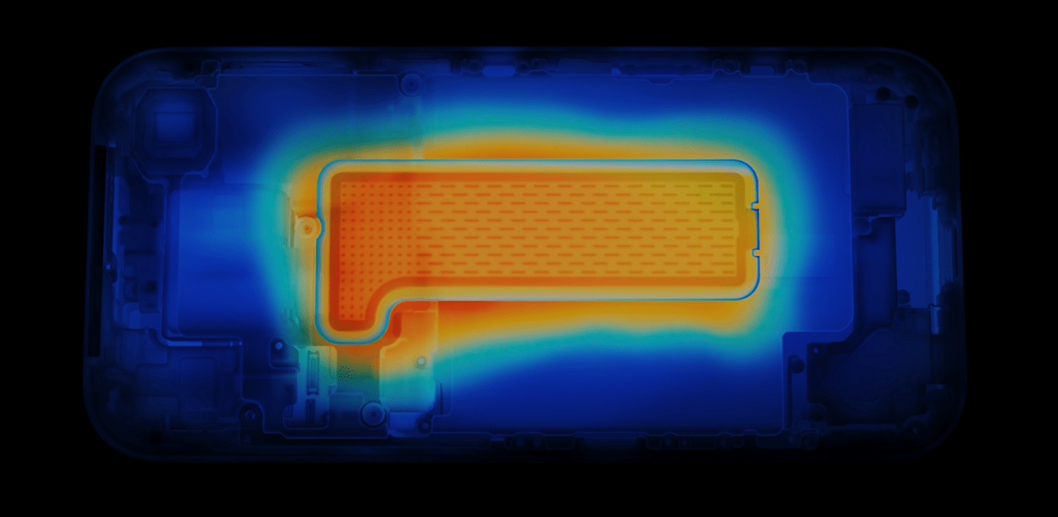
Apple made a big deal of the iPhone 17 Pro line’s new vapor chamber, which, combined with the aluminum case, is designed to dissipate heat better than before. In my experience so far, it absolutely does manage heat better, but that’s not to say the phone doesn’t get pretty warm. When I was setting up my new iPhone, it got quite warm, as did my old 16 Pro Max. However, while the 16 Pro Max got hot above the Apple logo on the back of the phone, the 17 Pro Max’s heat was more evenly distributed. That meant no one spot got as hot as the 16 Pro Max, but more of the phone got warm, including the sides, which I’d never really noticed with the previous model.

In the three days since I set up the 17 Pro Max, I’ve noticed it get warm now and then, but nothing close to as warm as the 16 Pro Max typically did. I’ve been out a couple of times on warm (80—85℉) sunny days taking photos and videos, and while the 17 Pro Max gets a little warm, it’s much less noticeable than before.

Hardware Design

Initially, I was a little underwhelmed by Apple’s iPhone lineup this year. I love the Air, but the camera tradeoffs were more than I was willing to make. As for the Pro line, I’m not a huge fan of the two-tone style and giant camera bump. It feels too industrial to me, which may be the point, but I prefer a sleeker look.

The orange case is great, but Cosmic Orange isn't for me.

The orange case is great, but Cosmic Orange isn’t for me.

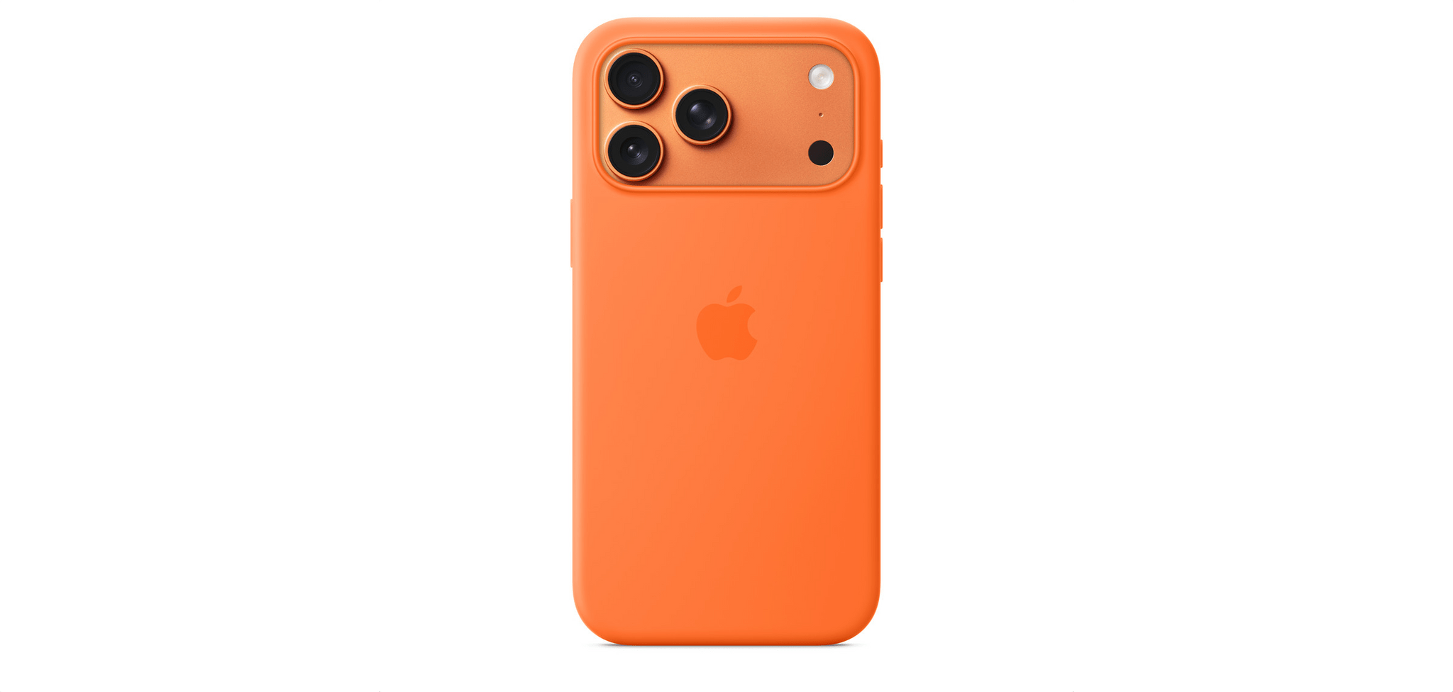
I was also disappointed by the Cosmic Orange color. I like orange but prefer something brighter like the orange Apple Silicone Case. As you can see from the image above, it’s brighter than the Cosmic Orange iPhone. I had a chance to compare them in person at a local Apple Store over the weekend, and all it did was confirm to me that I’d made the right choice getting the Deep Blue model.

Apple didn’t make a black iPhone 17 Pro this year, which led some people to expect the Deep Blue model would be closer to black than blue. As it turns out, although Deep Blue is a very dark blue, it’s not a blue that would be mistaken for black. It looks great and minimizes some of the phone’s industrial look that I don’t like, so it’s a big win in my eyes.

My Nomad MagSafe-compatible wallet usually covers the part of the 17 Pro Max with the Ceramic Shield.

My Nomad MagSafe-compatible wallet usually covers the part of the 17 Pro Max with the Ceramic Shield.

The only caveat is that the Ceramic Shield on the back makes a rectangular patch that looks a little closer to gray than I’d prefer. It’s not a huge deal since I usually have a MagSafe wallet hiding that area, but again, I’m not that into the two-tone look.

I love the rounded edges of the 17 Pro Max.

I love the rounded edges of the 17 Pro Max.

Surprisingly, another aspect of the 17 Pro Max that I absolutely love is the unibody design. There’s something about how the metal wraps around from the back to front that really works for me. Part of it is that the edges are rounder than on the iPhone 16 Pro Max, making the 17 Pro Max more comfortable to hold. The unibody design also makes the phone seem more sturdy. Plus, while I know intellectually that my new phone weighs 6 grams more than the 16 Pro Max, it doesn’t feel that way when I hold both, which I think has something to do with the fact that the rounder edges of the 17 Pro Max make it feel slimmer than it really is. In what may be another mind trick, the front glass of the iPhone 17 Pro Max feels a little smoother, too.

As I mentioned, I swung by my local Apple Store on Sunday to check out the iPhone Air and the latest accessories. I’ll get to the accessories in a bit, but when I saw the Air, I had that moment of amazement that it could be so thin and light, but not one moment of regret. The Air looks great, and I’m excited for what that sort of miniaturization of iPhone hardware means for future models, but it’s not for me.

I just like having a big battery and three cameras too much to trade those for a thin iPhone. Yesterday, I charged my phone early in the day, used it relatively lightly while I was working at my desk, and then headed out in the afternoon to test the cameras some more. When I went to bed last night, I left my phone on the couch by accident, where it sat until I got up today. It still had about 50% of its battery left. I love that I rarely have to think about whether my iPhone is charged, let alone worry about it.

The Cameras

Over the past few days, I’ve been experimenting with the iPhone 17 Pro Max’s three rear-facing cameras. In Austin Mann’s review of the iPhone 17 Pro’s cameras that I linked to yesterday, he said:

On the 16 Pro, the 5x (120mm) often felt a little too tight. The new 4x (100mm) feels far more natural and much more familiar. It’s a classic portrait and landscape focal length in the photography world, and with the bump up from 12MP to 48MP I’ve been really happy with the results.

I’m no pro photographer, but having used the new zoom cameras, I have to agree. Both focal lengths feel great, but the real star is the detail both can capture thanks to their 48MP sensors.

To show off what these cameras can do, I picked three scenes of things I might snap a quick photo of while out on a walk. I left the cameras on the Standard Photographic Style and didn’t do any cropping or editing, taking 24MP shots, which is also a default setting, with the Wide, Main, 2×, 4×, and 8× options.

First up is an island in Lake Norman:

Next, I walked over to Davidson College and took a series of photos of the steeple of the campus church:

Finally, I took a similar series of shots of Chambers Hall on campus:

I’m really pleased with the results. It was a bright, sunny day, which always helps, but to my untrained eye, there’s a noticeable improvement in image quality now that all of the iPhone 17 Pro’s cameras have 48MP sensors.

Accessories

I like the Neon Yellow Silicone Case with the Deep Blue iPhone 17 Pro Max.

I like the Neon Yellow Silicone Case with the Deep Blue iPhone 17 Pro Max.

When I stopped by the Apple Store over the weekend, I checked out the latest accessories, too, but didn’t buy anything. I prefer to use my iPhone caseless, but I wanted to see what my “official” options are because I do use a case when traveling.

Purple Fog goes well with Deep Blue, too.

Purple Fog goes well with Deep Blue, too.

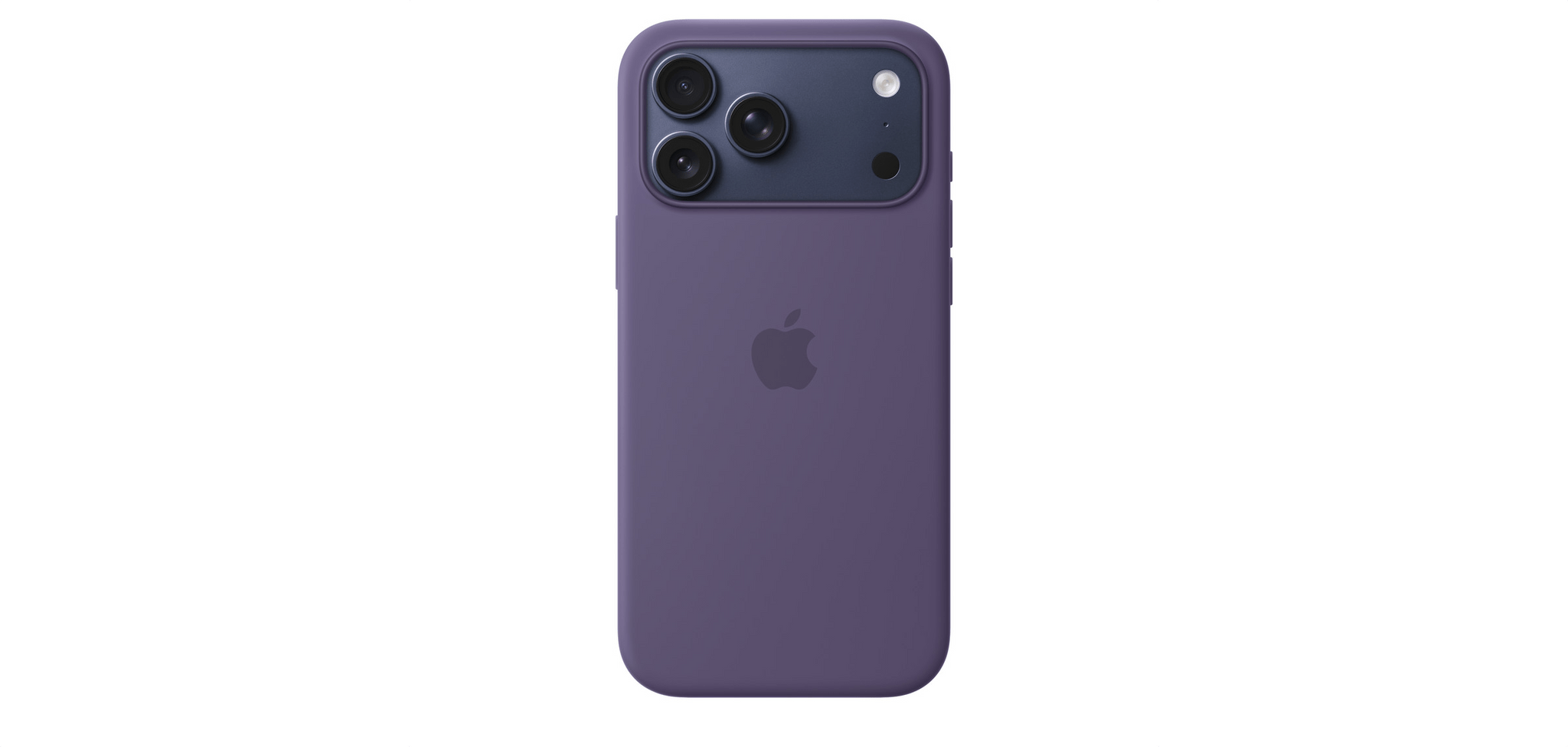
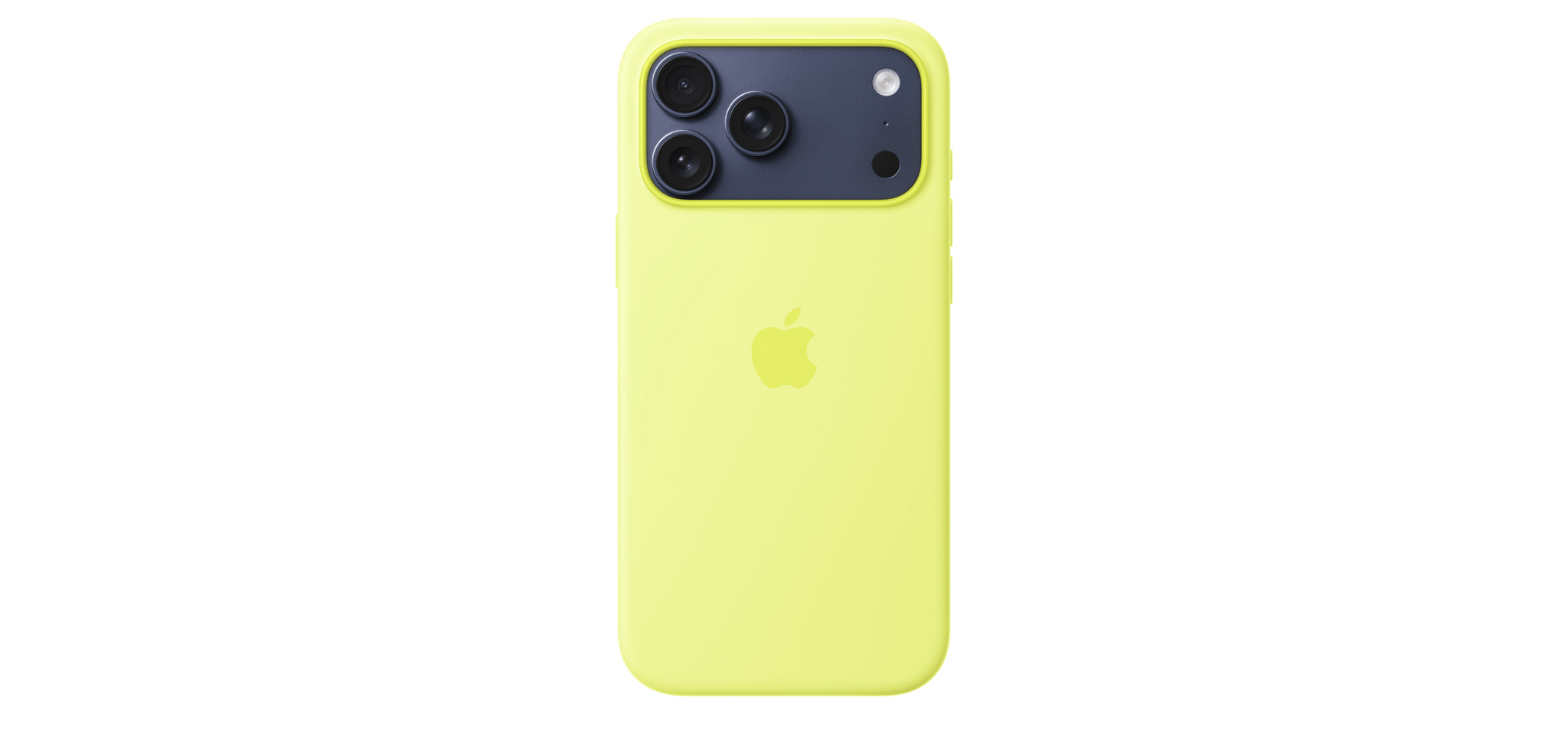
The TechWoven cases struck me as durable options, although I wasn’t wowed by any of the colors. Instead, I was drawn to the bright Silicone Cases. Historically, these cases aren’t the most durable, but as someone who gets a new phone every year, that’s less of a consideration. The bright orange is great, but for my Deep Blue iPhone 17 Pro Max, I think I’d probably go with Neon Yellow or Purple Fog.

I like the new Beats case but wouldn't like having a lanyard full-time just to have a way to prop up my iPhone.

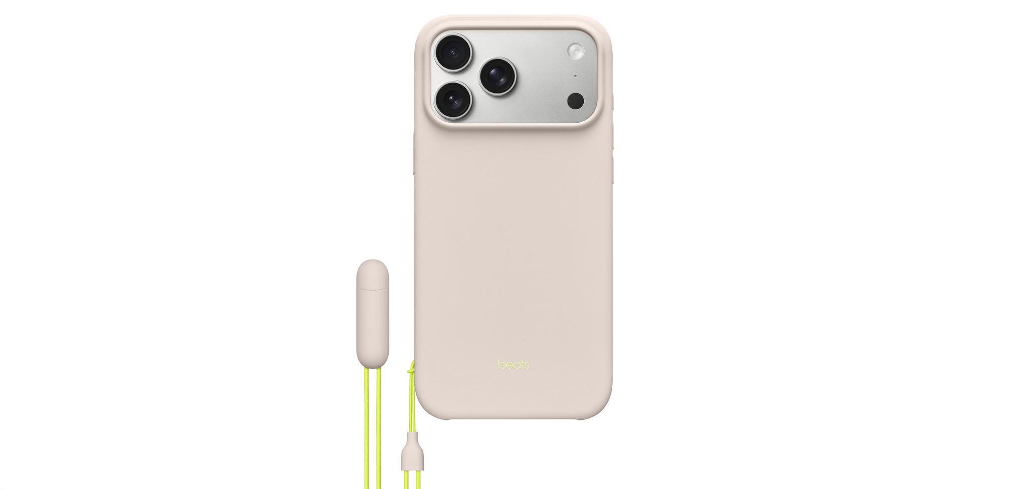
I like the new Beats case but wouldn’t like having a lanyard full-time just to have a way to prop up my iPhone.

I also checked out the new Beats cases. I love the little pill on the lanyard that you can pull apart to create a perfectly sized divot for propping your phone up. The colors are nice in person, too, but in the end, I didn’t buy one because I don’t want a lanyard on my iPhone.


So that’s my mini-review of the iPhone 17 Pro Max. It does the same Pro Max things I love with some nice perks like better cameras and a unibody design that’s functional and comfortable to hold while making the phone feel more substantial. Photographers and fans of great battery life really can’t go wrong with the iPhone 17 Pro Max.


CarPlay in iOS 26: The MacStories Review

When CarPlay Ultra was announced… checks notes… three years ago, it was a bold vision for the future of in-car displays. There was as much drooling over the new designs as there was skepticism over whether any car manufacturer would agree to such an extensive display overhaul.

Underneath all that, there were also some concerns about where this left regular, vanilla CarPlay. The kind that many people had fallen in love with, and which was often a prerequisite when buying a new car. Was this going away, or would it just be left to wither on the vine?

Thankfully, with iOS 26, the answer seems to be a firm “no” as Apple brings much more customization to our in-car displays, mainly by letting the much heralded features of CarPlay Ultra trickle down to regular CarPlay. There’s more than you’d think, so let’s take a look.

Read more


Mystery Solved: Why Third-Party Apps Vanished From the Mac’s Control Center

Just look at all those great third-party controls.

Just look at all those great third-party controls.

As I explained in my macOS Tahoe review, one of the biggest disappointments was how few third-party Control Center controls I had access to at launch. That was surprising to me given how many developers support Control Center on the iPhone and iPad.

So, I spent a lot of time investigating the issue without reaching a satisfactory answer until yesterday. The short story is it’s a bug, and there’s a workaround until it can be fixed by Apple, but here’s the rest of the back-story that didn’t make it into my macOS Tahoe review and how to sidestep it.

Read more


visionOS 26: The MacStories Review

As Apple’s newest and most cutting-edge platform, visionOS is also the hardest to nail down. Vision Pro as a product is still so nascent that people don’t quite know what to make of it. Is it a VR headset for gaming and watching movies? Is it a specialized tool for designers and doctors? Or could it be a computer that everyday people might one day be interested in using for both work and play?

The jury is still out. Although the Vision Pro is very much a product you can buy right now and visionOS is an operating system that users run every day, there’s still an intangible element surrounding the whole ordeal. Most people who aren’t enthusiasts or early adopters have no firsthand experience of what the platform is like. The current form factor limits the potential user base for visionOS to those willing to wear a bulky headset regularly. It’s simply not a platform that just anyone can easily pick up and try for themselves.

But for those who do take the plunge, there’s something about visionOS that’s undeniably compelling on a fundamental level. It just feels cool to see windows and objects within your real space and then be able to move them around freely using your eyes and hands. It’s an interaction model that’s long been dreamed about and speculated on, and it’s available in the here and now.

For some, the form factor tradeoffs and software limitations of the Vision Pro are enough to outweigh the novelty and magic of it all. But there are others who can’t get enough of visionOS as it stands today and can see its potential to be even more in the future. For them – well, I guess I should say for us – the Vision Pro feels like the future.

Based on the ways Apple is moving the platform forward this year, it seems that the company is listening to feedback from both parties. visionOS 26 includes flashy new features for Vision Pro superfans who want to get the most out of the platform’s unique immersive experiences, but it also packs in a bunch of quality-of-life improvements to bring it closer in line with Apple’s other platforms and make the system more approachable to everyday users. And at the same time, the platform is pushing further into areas of interest like gaming and collaboration where it can offer something truly unique from anything else in Apple’s lineup.

When I reviewed visionOS 2 last year, I was amazed at the progress that the platform’s development team had made in such a short time. That pace of growth has not let up over the past year, with enhancements like Apple Intelligence and a remade Guest User mode coming in the middle of the visionOS 2 cycle. And visionOS 26 keeps that rapid development going with a ton of new features, improvements, and capabilities that make Vision Pro even more powerful and enjoyable to use.

Let’s get into it.

Read more


    watchOS 26: The MacStories Review

    Last year was my first covering the watchOS beat with version 11. It turned out to be a trial by fire, with the annual software update for the world’s most popular smartwatch proving to be both sizable and significant.

    While controversy reigned over iOS, iPadOS, and macOS regarding new Apple Intelligence features, watchOS took an exit off of that highway to a more peaceful, focused road that contained real, tangible updates. There were long-requested customizations to Activity Rings, as well as added power and functionality in the Smart Stack. Brand new features like Training Load and the Vitals app started to hint that Apple was maybe, finally, getting serious about, well, serious athletes.

    If I’m being honest, I expected more of the same this year. The watchOS team seemed to be on a roll. Unfortunately, that hasn’t come to pass with watchOS 26, which – unlike watchOS 11 with Apple Intelligence – has been brought along for the ride with this year’s big controversy: Liquid Glass.

    Can watchOS 26 handle this big UI overhaul and still deliver some tangible additions in this, the year of the Apple Watch’s tenth anniversary? Let’s take a look.

    Read more


    macOS 26 Tahoe: The MacStories Review

    I’m going to cut to the chase – I like macOS 26 Tahoe a lot. No, it’s not perfect, and yes, I wish Apple had done even more, but that’s the case every year.

    What I love about Tahoe is its balance. It’s not the sort of thing you can draw up a set of specs or a table of pros and cons for. It just feels right.

    The heart of why Tahoe works is that it meets users where they are better than the typical annual release. If you’ve been using macOS for years and prefer to follow a beaten path through its features, you can. You may stumble across a new feature now and then, and you’ll notice visual differences thanks to Liquid Glass, but I’ve been moving between macOS Sequoia and Tahoe all summer long, and when I’m not seeking out what’s new, everything simply feels familiar and comfortable. That’s a good thing for an OS that’s relied upon by millions of people to get their work done.

    But you’re probably wondering how I can say that given the Liquid Glass design and online drama surrounding it over the summer. The thing is, whether you’re a Liquid Glass fan or foe, it’s just not as big of a deal on the Mac as it is elsewhere. I’ll explain what I like about Liquid Glass and what I don’t, but it hasn’t moved the needle at all when it comes to my daily work.

    What has moved the needle are the new features available in Tahoe. They won’t get in the way of your existing workflows, but if you’re interested iprn exploring new and better ways of getting things done, there’s a lot to like about this update. That’s why I’m such a big fan of macOS 26: it’s a release that walks a careful line between the familiar and the new. There’s no adjustment period, but there are plenty of new features to explore that I think will make a big difference in the way MacStories readers use their Macs.

    So join me for a tour off the beaten path to explore what you can expect to discover in macOS 26 Tahoe.

    Read more


    iOS and iPadOS 26: The MacStories Review

    Old and new through the liquid glass.

    My first job, I was in-house at a fur company with this old pro copywriter, Greek, named Teddy. And Teddy told me the most important idea in advertising is “new”. Creates an itch. You simply put your product in there as a kind of calamine lotion. But he also talked about a deeper bond with the product: nostalgia. It’s delicate, but potent.

    – Don Draper (Mad Men Season 1, Episode 13 – “The Wheel”)

    I was reminded of this Don Draper quote from one of my all-time favorite TV scenes – the Kodak Carousel pitch – when reflecting upon my contrasting feelings about iOS and iPadOS 26 a few weeks ago. Some of you may be wondering what I’m doing here, starting my annual review of an operating system with a Mad Men reference. But here we are today, with an eye-catching iOS update that, given the circumstances, is betting it all on the glittering allure of a new visual design, and a tablet operating system that comes full circle with old, almost nostalgic functionalities repurposed for the modern age.

    I’ve spent the past three months using and working with iOS and iPadOS 26, and there’s this idea I keep coming back to: the old and new coexist in Apple’s software strategy this year, and they paint a hyperrealistic picture of a company that’s stuck in a transition phase of its own making.

    Read more


    Thoughts on iPadOS 26: Hello, It’s Good to Be Back

    iPadOS 26.

    iPadOS 26.

    Apple released the first public betas of iOS and iPadOS 26 last week, and I’m going to cut to the chase with this story: although I’m still wrapping my head around Liquid Glass and trying to understand where this new design language will land, iPadOS 26 has fundamentally revolutionized my workflow in just a little over a month. While talking to Craig Federighi at WWDC, I did get the sense that Apple was approaching the iPad platform from a different – perhaps more humble – perspective, with a newfound willingness to listen to power users and find a better balance between the simplicity of the iPad and its flexibility. Actually using iPadOS 26, however, has far exceeded my expectations – which pushed me to completely rethink my desk setup (again) and the apps I use around the iPad Pro and iPadOS 26.

    Conversely, I’ve been struggling to understand iOS 26 and the role of Liquid Glass. I’ve documented my issues with Apple’s new design with a variety of examples recently, but the truth is that at this point in the beta cycle, I don’t know what to write about Liquid Glass yet. For this reason, despite my many attempts to write this story over the past few weeks, I’ve decided to take a different approach.

    Today, I only feel comfortable sharing my opinion about iPadOS 26, and I’ve chosen to delay my analysis of iOS 26 until later this year. I’ve found it incredibly challenging to form an opinion on Liquid Glass and iOS 26 when everything is still so in flux and being adjusted on a beta-by-beta basis. I feel like sharing what I think about Liquid Glass right now would be a fruitless exercise, or shortsighted perhaps, one way or another. Instead, since I find iPadOS 26 to be more of a known entity at the moment, I’ve decided to focus on that and how this software update is changing the way I work. The time will come for me to write about Liquid Glass and Apple’s vision for the future of its software design. Today, though, I’m all about the iPad.

    It’s been an interesting month since WWDC. This year more than ever, I have a feeling that Apple isn’t done tweaking its OSes and much will continue to change between now and September. But for now, as always, let’s dive in.

    Read more


    macOS Tahoe: The MacStories Public Beta Preview

    Author’s Note: Apple released the public beta of macOS 26 Tahoe last Thursday, two days after developer beta 4. Instead of rushing a preview of Tahoe to publication at the risk of missing important aspects of the release, I chose to spend the time necessary to thoroughly test Tahoe first.


    A year ago, the macOS Sequoia public beta debuted with a long list of caveats. Many of the features that had been shown off at WWDC 2024 weren’t in that initial public beta release or even the initial macOS 15.0 release, and some features, like a smarter Siri, still haven’t shipped. That made Sequoia feel incomplete.

    The release of macOS Tahoe 26 promises to be different. The features highlighted during WWDC 2025 are all in the public beta. Some are more polished than others, but everything is there to try today. With its surprisingly long list of new system apps, changes big and small at the macOS system level, and, of course, Liquid Glass, Tahoe’s public beta release is a fun one for users who like to explore Apple’s latest macOS innovations as early as possible.

    I’m not sold on every feature, but it’s still early, and this is a beta, so I’ll reserve my final judgment for the fall. However, there’s a lot coming in macOS Tahoe, which makes it worth taking a closer look at today, so let’s dig in.

    Read more