
Typography can make or break your social media presence. The right font catches attention in a crowded feed, conveys your brand personality instantly, and drives engagement with every post you share. As we approach 2026, font trends are evolving beyond simple aesthetics—they’re becoming strategic tools for standing out in an increasingly visual digital landscape.
This comprehensive guide explores the 10 typography trends transforming social media design in 2026. You’ll discover what’s driving each trend, when to use it, and exactly how to implement it in your content—no design degree required. Whether you’re creating Instagram stories, LinkedIn carousels, or TikTok thumbnails, these font trends will help you craft more compelling, professional designs in minutes.
In this guide, you’ll learn:
- The 10 dominant font trends shaping visual design in 2026
- Best use cases and platforms for each typography style
- How to apply these trends using free design tools like Simplified
- Pro tips for pairing trendy fonts with readability and accessibility
- Common mistakes to avoid when following font trends
Let’s dive into the typography styles that will define your social media presence in 2026.
1. Bold, Thick Strokes: Maximum Impact Typography
What It Is
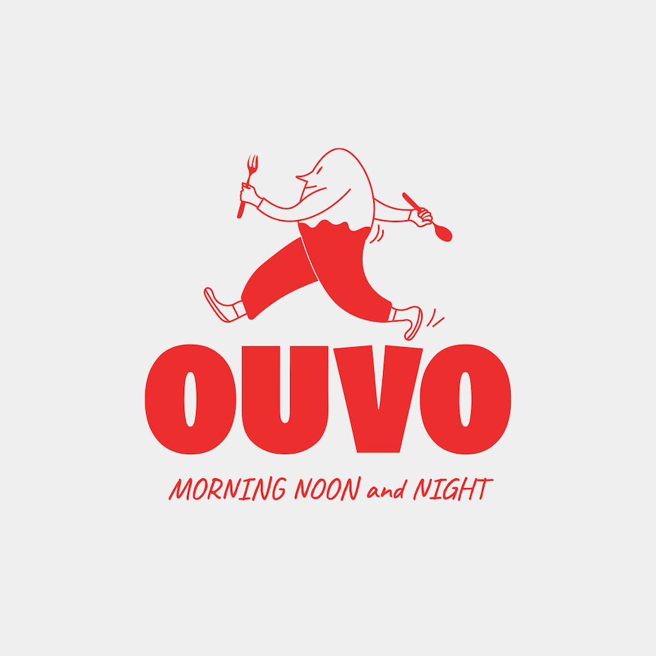
Bold, thick-stroke typography features heavy, substantial letterforms with increased weight that command immediate attention. These cool fonts abandon subtlety for pure visual power, making every word feel important and impossible to scroll past.
Why It’s Trending in 2026
In an era of shrinking attention spans and infinite scroll, bold typography cuts through digital noise like nothing else. Social media platforms increasingly favor high-contrast, eye-catching content in their algorithms. Thick strokes also maintain readability on mobile screens—where 80% of social media consumption happens—and translate beautifully across video, static posts, and stories.
The rise of short-form video content on TikTok, Instagram Reels, and YouTube Shorts has accelerated this trend. Bold fonts ensure text remains legible even in fast-moving, 15-second clips where viewers barely have time to process information.
Best Use Cases
- Headlines and attention-grabbers: Perfect for carousel covers, video thumbnails, and post titles
- Call-to-action buttons: “Shop Now,” “Learn More,” “Download Free”
- Quote graphics: Make inspirational or testimonial content pop
- Brand statements: Communicate confidence and authority
- Platform recommendations: Instagram Stories, TikTok overlays, LinkedIn carousel titles
How to Apply in Simplified
Simplified’s font library includes dozens of bold, thick-stroke fonts optimized for social media. Navigate to the Text tool, search for “bold” or “heavy” fonts, and apply them to headlines. Use Simplified’s AI-powered font pairing feature to automatically match your bold headlines with complementary body fonts that maintain readability.
Pro Tip: Pair thick-stroke headlines with lightweight, minimal body text to create visual hierarchy. This contrast guides viewers’ eyes exactly where you want them to go.
When to Exercise Caution
Bold fonts work brilliantly for short text (1-5 words) but become overwhelming in longer passages. Avoid using thick strokes for paragraphs, descriptions, or any text requiring sustained reading. Also consider accessibility—ensure sufficient contrast between your bold text and background colors.
Bonus: 12 Romantic Valentine’s Day Fonts For Your Design
2. Retro Revival: Nostalgic Typography Returns
What It Is
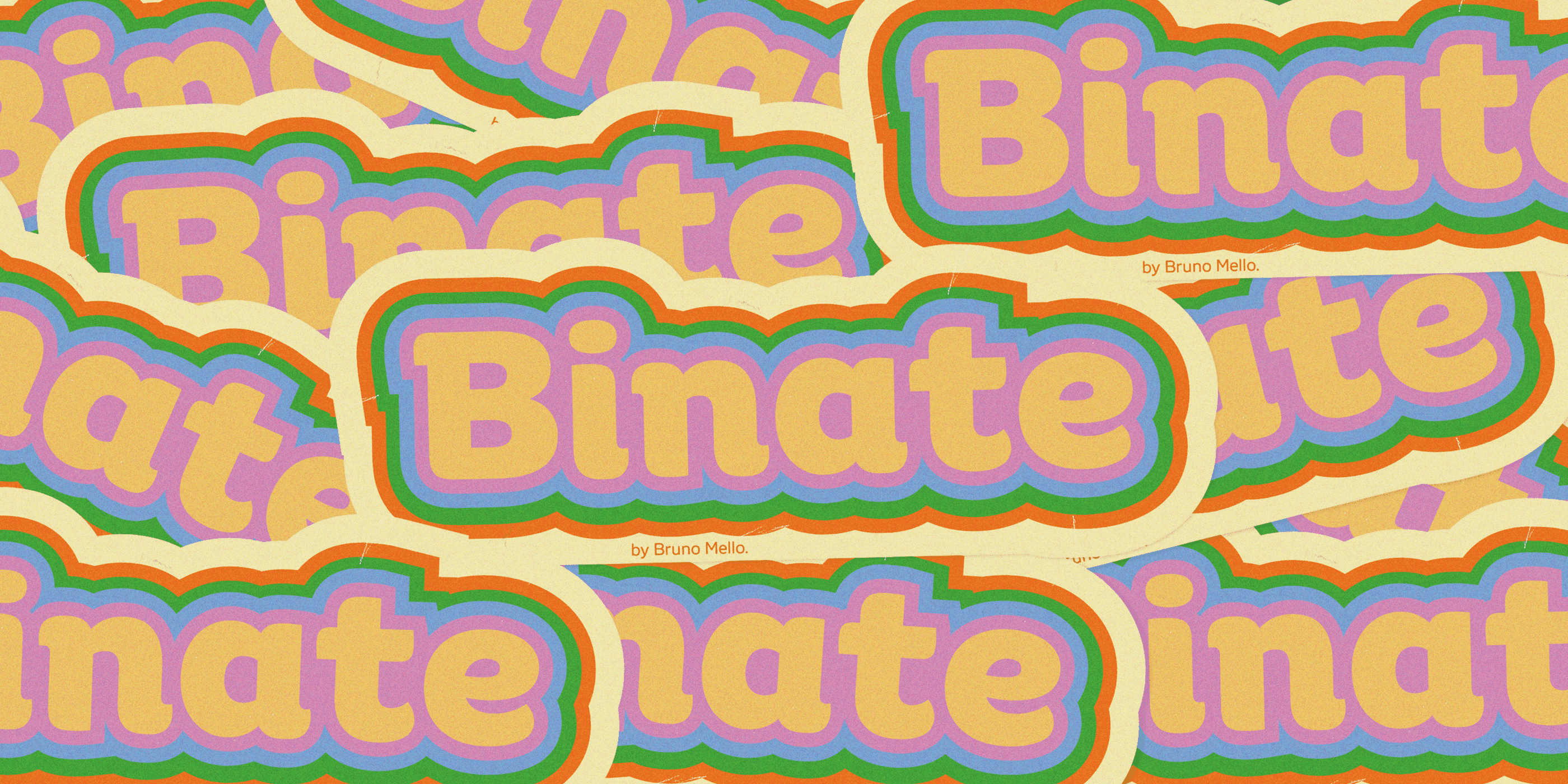
Retro typography resurrects design styles from the 1960s through 1990s, featuring groovy curves, vintage serifs, psychedelic letterforms, and nostalgic color palettes. These fonts evoke specific eras—from disco-era bubbly scripts to 80s neon aesthetics and 90s grunge vibes.
Why It’s Trending in 2026
Nostalgia marketing has become one of the most powerful emotional triggers in digital content. As Gen Z and Millennials gain purchasing power, brands tap into formative cultural memories through vintage aesthetics. Retro fonts instantly communicate authenticity, warmth, and human connection—a refreshing contrast to sterile, overly-polished modern design.
Social media thrives on emotional resonance, and few design choices evoke feelings as quickly as typography that reminds us of simpler times. Whether it’s Y2K bubble letters or 70s groovy serifs, retro fonts tell stories before words do.
Best Use Cases
- Lifestyle brands: Fashion, music, entertainment, and cultural content
- Throwback campaigns: Anniversary posts, “then vs. now” content, decade-themed promotions
- Creative industries: Agencies, studios, and artists establishing unique visual identity
- Event promotions: Concerts, festivals, themed parties
- Platform recommendations: Instagram feed posts, Pinterest graphics, Facebook event covers
How to Apply in Simplified
Browse Simplified’s vintage and retro font categories to find period-specific styles. The platform’s template library includes pre-designed retro layouts you can customize in seconds. Use Simplified’s color palette generator to automatically create era-appropriate color schemes that complement your chosen retro font.
Pro Tip: Match your retro font choice to your brand’s personality and target demographic. 70s fonts appeal to wellness and natural brands, 80s neon works for tech and gaming, while 90s grunge resonates with alternative and youth-focused brands.
Design Considerations
Retro fonts can quickly become kitsch if overused. Balance vintage typography with modern design elements—clean layouts, generous white space, and contemporary imagery—to create a fresh take on nostalgia rather than a dated pastiche.
Bonus: Font Generator: Create Custom Typography in Minutes
3. Sharp Serifs: Precision Meets Elegance

What It Is
Sharp serif fonts feature crisp, angular serifs with precise geometric terminals instead of traditional rounded or bracketed serifs. These modern interpretations of classical typography combine the sophistication of serifs with contemporary edge and clarity.
Why It’s Trending in 2026
The sharp serif trend represents a renaissance in editorial design for social media. As platforms mature beyond casual content toward long-form articles, newsletters, and professional thought leadership, users crave typography that signals credibility and refinement.
High-resolution displays on modern devices finally render these delicate details beautifully, making sharp serifs practical for digital-first design. Brands seeking to establish authority while maintaining modern appeal have embraced sharp serifs as the perfect middle ground between traditional and contemporary.
Best Use Cases
- Professional content: LinkedIn articles, business updates, industry insights
- Editorial layouts: Blog headers, magazine-style carousels, long-form content
- Luxury brands: Fashion, jewelry, real estate, premium services
- Formal announcements: Product launches, company milestones, awards
- Platform recommendations: LinkedIn, Medium embeds, Instagram carousel body text
How to Apply in Simplified
Select sharp serif fonts from Simplified’s “Modern” or “Editorial” categories. These fonts work exceptionally well in Simplified’s carousel maker for multi-slide content that requires sustained readability. The platform’s alignment and spacing tools help you achieve the precise, polished look sharp serifs demand.
Pro Tip: Sharp serifs shine in larger sizes (18pt+) where their details are visible. Combine them with ample line spacing (1.4-1.6x) and generous margins to create breathable, sophisticated layouts that demand attention without shouting.
Typography Pairing
Sharp serifs pair beautifully with geometric sans-serif fonts for subheadings and captions. This combination creates visual contrast while maintaining a cohesive, professional aesthetic that works across all social platforms.
Bonus: 15 Subtitle Fonts for Every Style: A Comprehensive List
4. Experimental & Edgy: Breaking Typography Rules
What It Is
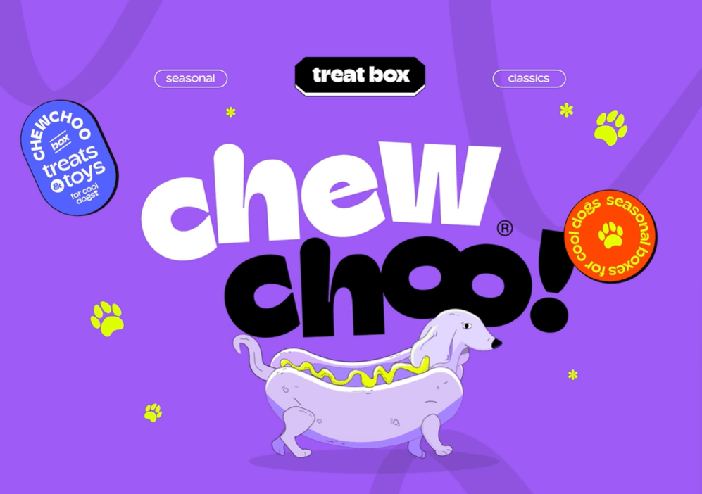
Experimental typography intentionally breaks conventional design rules through deconstructed letterforms, unconventional spacing, unexpected angles, and artistic distortions. These fonts prioritize creative expression and visual impact over traditional readability standards.
Why It’s Trending in 2026
Social media rewards risk-takers who stop the scroll. As users become increasingly desensitized to conventional design, experimental typography offers the shock value needed to capture attention. Creative industries—from agencies to artists to innovative startups—use experimental fonts to signal innovation and boundary-pushing thinking.
The rise of AI-generated content has also accelerated this trend. As algorithms produce more homogeneous design, human designers rebel with deliberately unconventional, handcrafted typography that asserts creative individuality.
Best Use Cases
- Creative portfolios: Designers, artists, photographers showcasing unique perspectives
- Disruptive brands: Startups and companies challenging industry norms
- Campaign launches: Attention-grabbing announcements that demand notice
- Event promotions: Art exhibitions, music festivals, alternative culture events
- Platform recommendations: Instagram Stories (with high engagement rates), TikTok creator content, Twitter/X graphics
How to Apply in Simplified
Simplified’s design freedom tools and font generator let you manipulate experimental fonts with rotation, distortion, and layering effects. Start with the platform’s avant-garde font collection, then use custom spacing and positioning to create truly unique layouts. The multi-layer canvas makes it easy to combine experimental typography with other design elements.
Pro Tip: Use experimental fonts sparingly—a single experimental word in an otherwise clean layout creates maximum impact. Reserve these fonts for 1-3 words maximum, and pair them with ultra-simple backgrounds to let the typography be the hero.
Balancing Innovation and Communication
The challenge with experimental typography is maintaining just enough readability to communicate your message. Test your designs on multiple devices and with diverse viewers. If more than 10% of your audience struggles to read your text, you’ve pushed too far into pure art at the expense of communication.
5. Gothic Romance: Dark, Dramatic, Distinctive

What It Is
Gothic typography encompasses blackletter fonts, medieval-inspired serifs, ornate Victorian letterforms, and modern interpretations of historical dark aesthetics. These fancy fonts carry centuries of cultural weight, evoking mystery, sophistication, and dramatic intensity.
Why It’s Trending in 2026
The gothic aesthetic has surged beyond its traditional niches into mainstream social media through dark academia trends, fantasy media popularity (think House of the Dragon, Wednesday), and alternative fashion movements. Gothic fonts provide instant visual storytelling, transporting viewers to different times and moods before they read a single word.
Luxury brands have particularly embraced modern gothic fonts as a way to convey heritage, exclusivity, and timeless elegance. The ornate details that once limited gothic fonts to print now display beautifully on high-resolution screens.
Best Use Cases
- Luxury and heritage brands: Jewelry, fashion houses, premium spirits, historic hotels
- Entertainment content: Book launches, movie promotions, gaming announcements
- Seasonal campaigns: Halloween content, winter collections, mystery themes
- Alternative brands: Goth fashion, dark beauty, niche cultural communities
- Platform recommendations: Instagram feed posts with high visual impact, Pinterest graphics, Tumblr aesthetics
How to Apply in Simplified
Explore Simplified’s “Elegant” and “Decorative” font categories for gothic-inspired options. The platform’s layering features let you combine gothic typography with textured backgrounds—think aged paper, stone textures, or dramatic lighting effects—to amplify the aesthetic. Simplified’s color palettes tools make it easy to work with the dark, rich color palettes gothic designs demand.
Pro Tip: Modern gothic works best when you balance ornate typography with clean, minimalist layouts. Let the font be decorative while keeping surrounding elements simple. This approach makes gothic typography feel contemporary rather than costume-like.
Readability Considerations
Gothic fonts can be notoriously difficult to read in smaller sizes or longer passages. Use them exclusively for headlines, featured words, or short phrases (3-7 words maximum). Always pair gothic headlines with highly readable sans-serif or clean serif body text.
Bonus: Create Beautiful Fonts in One Click and Redefine your creative expression with Simplified
6. Handwritten Personalization: The Human Touch

What It Is
Handwritten fonts replicate the organic imperfection of human handwriting, from casual marker scripts to elegant calligraphy to messy sketch styles. These fonts prioritize authenticity and personal connection over geometric perfection.
Why It’s Trending in 2026
In a world increasingly dominated by AI-generated content and corporate polish, handwritten typography signals the human element behind your brand. Social media users crave authentic connections, and handwritten Cursive fonts communicate approachability, warmth, and genuine personality.
The personalization trend has reached new heights as consumers demand brands that feel like friends rather than faceless corporations. Handwritten typography helps humanize digital communication, making your social content feel like a message from a person rather than a marketing department.
Best Use Cases
- Personal brands: Coaches, consultants, creators building intimate audience relationships
- Behind-the-scenes content: Team introductions, culture posts, personal stories
- User-generated content: Testimonials, customer quotes, community highlights
- Casual announcements: Updates, reminders, friendly check-ins
- Platform recommendations: Instagram Stories (especially for polls and Q&As), Facebook community posts, LinkedIn personal updates
How to Apply in Simplified
Simplified offers hundreds of handwritten and script fonts ranging from elegant calligraphy to casual marker styles. The platform’s templates include layouts specifically designed for handwritten text, with complementary elements like underlines, arrows, and doodles that enhance the personal feel. Use Simplified’s brand kit feature to save your favorite handwritten fonts for consistent personality across posts.
Pro Tip: Match your handwritten font style to your brand personality. Elegant scripts work for premium/lifestyle brands, casual handwriting suits approachable service businesses, and messy sketches fit creative or youthful brands. Consistency is key—changing handwritten styles frequently dilutes your authentic voice.
Legibility Best Practices
While authenticity is crucial, your text must remain readable. Choose handwritten fonts with clear letterforms, adequate spacing, and sufficient contrast against backgrounds. Test readability on mobile devices—if your grandmother can’t read it on her phone in 3 seconds, choose a clearer option.
Bonus: Picking The Right Fonts For Your Website: Simplified Guide
7. Detail-Oriented Design: Typography as Art
What It Is
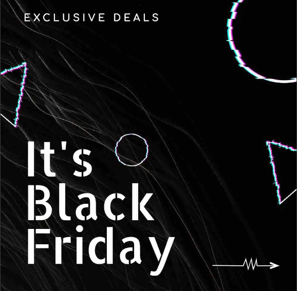
Detail-oriented typography features intricate embellishments, fine decorative elements, complex ligatures, and artistic flourishes that transform text into miniature works of art. These fonts reward close inspection, revealing layers of craftsmanship in every letterform.
Why It’s Trending in 2026
As social media users develop increasingly sophisticated visual literacy, they appreciate craftsmanship and artistry in design. Detail-rich typography creates “thumb-stopping” moments—that split-second where a user pauses mid-scroll because something beautiful caught their eye.
The trend also reflects a broader movement toward slow content and mindful consumption. While much of social media optimizes for speed, detail-oriented design invites viewers to linger, appreciate, and engage more deeply with content. This increased engagement time signals quality to platform algorithms, boosting organic reach.
Best Use Cases
- Brand storytelling: Origin stories, craftsmanship highlights, heritage content
- Special announcements: Product launches, milestone celebrations, exclusive offers
- Premium content: Webinar promotions, course launches, high-value resources
- Visual quotes: Inspirational content, thought leadership, book excerpts
- Platform recommendations: Instagram carousel covers, Pinterest graphics, LinkedIn featured images
How to Apply in Simplified
Simplified’s ornate and decorative font categories include detailed options perfect for art-focused designs. The platform’s high-resolution export ensures every intricate detail renders crisply, even when users zoom in. Use Simplified’s spacing and kerning controls to give detailed fonts room to breathe—tight spacing obscures delicate features.
Pro Tip: Detail-oriented fonts work best at larger sizes (36pt+) where their craftsmanship is visible. Use them for featured headlines or single-word emphasis. Pair with generous negative space and simple backgrounds to let the typography complexity shine without visual competition.
When Less Is More
Detailed fonts can quickly become overwhelming if overused. Follow the “one statement piece” rule—let your ornate typography be the focal point while keeping every other design element minimal. This restraint makes your detailed typography feel intentional and sophisticated rather than cluttered.
8. Variable Fonts: Adaptive Typography Revolution
What It Is
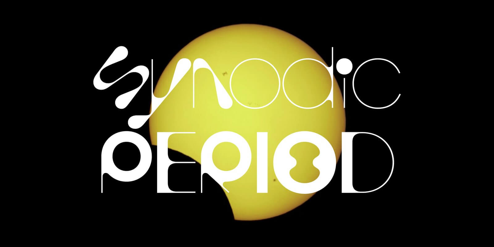
Variable fonts are single font files containing multiple variations—different weights, widths, and styles—that designers can adjust along continuous axes. Instead of separate files for light, regular, bold, and black weights, variable fonts offer infinite variations within one responsive typeface.
Why It’s Trending in 2026
Variable fonts represent the technical evolution of typography for the digital age. They solve the longstanding challenge of responsive design—ensuring text looks perfect across devices without loading multiple font files. For social media creators, this means faster-loading content and unlimited creative flexibility.
As social platforms increasingly support advanced web technologies, variable fonts enable dynamic typography that adapts to context. Imagine text that subtly shifts weight as users scroll, or fonts that automatically optimize readability based on screen size. Variable fonts make these possibilities real.
Best Use Cases
- Responsive social graphics: Content that adapts to different platform requirements
- Animation and motion: Text that transitions smoothly between weights for video content
- Adaptive headlines: Typography that adjusts for varying text lengths
- Platform-optimized content: Single designs that look perfect everywhere
- Platform recommendations: All platforms benefit, especially multi-format content (stories + feed + carousel)
How to Apply in Simplified
Simplified’s design platform supports variable fonts with intuitive weight and width sliders. You can experiment with different variations in real-time, finding the perfect typography for each specific post. The platform’s responsive templates automatically adjust variable fonts for optimal display across devices and platforms.
Pro Tip: Variable fonts excel in creating visual hierarchy without changing typefaces. Use heavier weights for headlines, medium weights for subheadings, and lighter weights for body text—all from the same font family. This approach creates cohesive designs with built-in consistency.
Technical Advantages
Beyond aesthetics, variable fonts reduce file sizes (faster loading times = better engagement metrics) and simplify design systems (fewer fonts to manage = more consistency). For brands creating high-volume social content, these efficiency gains compound significantly over time.
Bonus: Your Ultimate Guide to Typefaces: Serif vs. Sans Serif Fonts
9. Liquid Typography: Fluid, Organic Movement

What It Is
Liquid typography features fluid, flowing letterforms that appear to melt, drip, wave, or morph. These fonts mimic water, lava, or other viscous substances, creating organic movement and visual intrigue even in static designs.
Why It’s Trending in 2026
Liquid typography brings motion to static images—a crucial advantage in social media feeds dominated by video. Even without animation, liquid fonts suggest movement, energy, and transformation. They stop the scroll by breaking the rigid geometry users expect from text.
The trend aligns with broader design movements toward organic, nature-inspired aesthetics as a counterbalance to geometric minimalism. Liquid fonts feel alive, spontaneous, and slightly unpredictable—qualities that humanize digital design and create emotional resonance.
Best Use Cases
- Youth-oriented brands: Gen Z marketing, trendy products, cultural movements
- Creative industries: Music, entertainment, arts, digital culture
- Energy and movement themes: Fitness content, dance promotions, dynamic brands
- Summer and tropical campaigns: Seasonal content with fluid, relaxed vibes
- Platform recommendations: TikTok (aligns with platform’s energetic culture), Instagram Reels, YouTube thumbnails
How to Apply in Simplified
Simplified’s contemporary font library includes liquid-inspired options perfect for eye-catching social content. The platform’s animation features let you enhance static liquid fonts with subtle movement effects for video posts. Pair liquid typography with complementary visual elements like gradients, waves, or fluid shapes to amplify the organic aesthetic.
Pro Tip: Liquid fonts work brilliantly for single words or short phrases that capture attention. Use them for action words (“Flow,” “Splash,” “Dive”) or brand names where the fluid aesthetic aligns with your identity. Avoid liquid fonts for body text or information-heavy content where readability is paramount.
Color and Context
Liquid typography comes alive with the right color choices. Consider gradients that enhance the fluid effect, or transparent overlays that make letters appear genuinely liquid. Context matters—liquid fonts feel natural for beverage brands, water-related content, or summer campaigns, but might seem forced in corporate or traditional contexts.
10. Narrow Serifs: Elegant Space Efficiency
What It Is
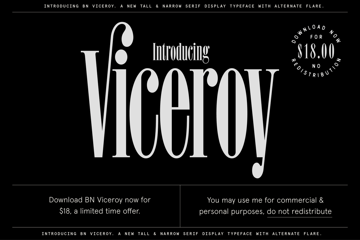
Narrow serif fonts feature condensed letterforms with traditional serif details, allowing more characters per line while maintaining elegance and sophistication. These space-efficient fonts combine the refinement of serifs with the practicality of condensed layouts.
Why It’s Trending in 2026
Mobile-first design demands typography that maximizes limited screen space without sacrificing aesthetics. Narrow serifs solve this challenge beautifully, fitting more impactful words in headlines and captions while maintaining the credibility and elegance that serif fonts provide.
The trend also reflects a return to editorial design principles in social media. As platforms evolve beyond casual content toward articles, newsletters, and thought leadership, narrow serifs provide the sophisticated, magazine-like aesthetic that signals authority and professionalism.
Best Use Cases
- Long-form social content: LinkedIn articles, carousel essays, educational posts
- Headlines with many words: Fitting complete thoughts without truncation
- Professional services: Law firms, consulting, finance, healthcare
- Publication-style content: Blog header images, article features, quote graphics
- Platform recommendations: LinkedIn (particularly strong match), Twitter/X text graphics, Pinterest pins with text
How to Apply in Simplified
Browse Simplified’s “Condensed” and “Editorial” font categories for narrow serif options. The platform’s text tools include kerning adjustments that let you fine-tune spacing for optimal readability. Simplified’s LinkedIn and professional templates are specifically designed to showcase narrow serifs at their best.
Pro Tip: Narrow serifs work exceptionally well in all-caps settings for elegant, space-efficient headlines. Combine uppercase narrow serifs with sentence-case body text in a wider sans-serif font to create balanced, scannable layouts that guide readers through your content.
Avoiding the Cramped Look
While narrow fonts maximize space, they can feel claustrophobic if not balanced properly. Use generous line height (1.5-1.8x), adequate margins, and strategic negative space to let your narrow serifs breathe. The goal is elegant efficiency, not visual congestion.
Bonus: Minimalist Fonts: The What, The Why & The Best Ones
Choosing the Right Font Trend for Your Brand
With ten distinct typography trends to choose from, how do you decide which styles align with your brand and social media goals? Use this strategic framework to guide your font selection.
Match Trends to Brand Personality
| If Your Brand Is… | Consider These Trends | Why |
|---|---|---|
| Professional, Corporate | Sharp Serifs, Narrow Serifs | Convey credibility and sophistication |
| Youthful, Energetic | Bold Strokes, Liquid Typography | Create high energy and visual impact |
| Creative, Artistic | Experimental, Detail-Oriented | Showcase innovation and craftsmanship |
| Personal, Approachable | Handwritten, Retro Revival | Build authentic connections and warmth |
| Luxury, Premium | Gothic Romance, Sharp Serifs | Communicate exclusivity and elegance |
| Tech, Forward-Thinking | Variable Fonts, Experimental | Demonstrate innovation and modernity |
Platform-Specific Considerations
Different social platforms favor different typography approaches:
Instagram: Visual impact matters most. Bold Strokes, Liquid Typography, and Gothic Romance perform exceptionally well.
LinkedIn: Professional credibility is key. Sharp Serifs, Narrow Serifs, and Variable Fonts establish authority.
TikTok: Energy and movement win. Experimental, Liquid Typography, and Bold Strokes capture attention.
Pinterest: Detail and beauty drive saves. Detail-Oriented, Retro Revival, and Gothic Romance inspire pinners.
Twitter/X: Clarity and quick readability rule. Bold Strokes, Variable Fonts, and Narrow Serifs work best.
The Multi-Font Strategy
You don’t need to commit to a single trend. The most effective brands use 2-3 complementary font trends strategically:
- Primary font: Your most-used style, aligned with core brand personality (appears in 60% of content)
- Accent font: A complementary trend for special emphasis or specific content types (30% of content)
- Experimental font: An occasional wild card for campaign launches or attention-grabbing posts (10% of content)
This approach provides consistency while maintaining visual variety that keeps your feed interesting.
5 Common Font Trend Mistakes to Avoid
Even beautiful typography can fail when applied incorrectly. Avoid these frequent pitfalls:
1. Sacrificing Readability for Trendiness
The Problem: Choosing experimental or decorative fonts for body text makes your content exhausting to read.
The Solution: Reserve trendy fonts for headlines, featured words, and short phrases (3-7 words maximum). Use clean, highly readable fonts for descriptions, captions, and longer text blocks.
2. Mixing Too Many Trends
The Problem: Using multiple trend-heavy fonts in a single design creates visual chaos and dilutes your message.
The Solution: Follow the “one statement font” rule. Let one trend-driven font be your hero, then pair it with neutral, supportive typography that doesn’t compete for attention.
3. Ignoring Mobile Readability
The Problem: Fonts that look stunning on desktop become illegible on mobile devices where 80% of your audience views content.
The Solution: Always preview your designs on mobile before publishing. Increase font sizes, simplify complex letterforms for small screens, and ensure adequate contrast between text and backgrounds.
4. Choosing Fonts That Don’t Match Your Message
The Problem: Using playful liquid fonts for serious business announcements or gothic fonts for children’s content creates cognitive dissonance.
The Solution: Your typography should reinforce your message, not contradict it. Ask: “Does this font match the emotion I want to convey?” before finalizing designs.
5. Neglecting Accessibility
The Problem: Low contrast, overly decorative fonts, or tiny text sizes exclude audiences with visual impairments.
The Solution: Test your typography against WCAG accessibility standards. Ensure 4.5:1 minimum contrast ratios, provide alt text describing your text-based images, and avoid fonts where letters are easily confused (like I and l).
Frequently Asked Questions
What are the biggest font trends for 2026?
The top font trends for 2026 include bold thick-stroke typography for maximum impact, retro revival styles bringing 70s-90s nostalgia, sharp modern serifs balancing tradition and contemporary design, experimental typography breaking conventional rules, gothic fonts adding dramatic sophistication, handwritten styles for authentic personalization, detail-oriented decorative fonts, variable fonts offering unprecedented flexibility, liquid typography with organic flowing forms, and narrow serifs providing elegant space efficiency for mobile-first design.
How do I choose the right font trend for my brand?
Match font trends to your brand personality and audience expectations. Professional brands should lean toward sharp serifs and narrow serifs for credibility, while creative brands can experiment with bold experimental styles. Consider your primary social platform—Instagram favors high visual impact fonts, LinkedIn rewards professional typography. Select 2-3 complementary trends: a primary font for 60% of content, an accent font for 30%, and an experimental option for 10% of special campaigns.
Are trendy fonts always readable?
No. Many trendy fonts prioritize visual impact over readability, which is why they should be reserved for headlines, featured words, or short phrases only. Never use highly decorative, experimental, or complex fonts for body text, long captions, or information-heavy content. Always pair trendy headline fonts with clean, simple fonts for descriptions and supporting text. Test every design on mobile devices before publishing to ensure your target audience can easily read your content.
Where can I find free fonts for these 2026 trends?
Simplified offers an extensive library of fonts covering all 2026 trends, with both free and premium options included in your account. The platform’s font categories are organized by style (Bold, Retro, Modern, Experimental, etc.), making it easy to find trend-aligned options. You can also explore Google Fonts for free commercial-use fonts, though Simplified’s curated library is optimized specifically for social media design and includes fonts that render beautifully at various sizes and resolutions.
Can I mix multiple font trends in one design?
Yes, but with restraint. The most successful approach is the “one statement font” rule: let one trend-driven font be your focal point while keeping all other typography neutral and supportive. For example, you might use bold thick strokes for your headline and pair it with a simple sans-serif for body text. Mixing two or more equally bold trend fonts in a single design typically creates visual chaos rather than compelling composition. Hierarchy and restraint make trend-mixing successful.
How often should I update my brand typography?
For core brand assets (logos, website headers, official materials), maintain typographic consistency for 3-5 years to build recognition. For social media content, you have more flexibility. Incorporate 2-3 on-trend fonts into your rotation while keeping your primary brand font consistent. This approach lets you stay current without confusing your audience with constantly changing brand identity. Update your accent and experimental fonts annually to reflect emerging trends while maintaining overall brand cohesiveness.
What’s the difference between display fonts and body fonts?
Display fonts are designed for large sizes and short text—headlines, titles, featured words—where visual impact and personality matter most. Many 2026 trends fall into this category. Body fonts are optimized for smaller sizes and longer passages, prioritizing readability, eye comfort, and clarity over decorative details. Most trendy fonts are display fonts and should never be used for body text. A well-designed social post uses display fonts for headlines and body fonts for descriptions, creating both visual interest and easy reading.
Do font trends affect social media engagement?
Yes, significantly. Typography is often the first thing viewers process when encountering your content, and it sets expectations for quality, brand personality, and content value. Research shows that posts with visually compelling typography receive 40% higher engagement than those with generic fonts. However, readability trumps trendiness—if your audience can’t easily read your text, no amount of stylish typography will save your engagement rates. The winning formula combines on-trend visual appeal with crystal-clear readability.
How do I use these font trends with Simplified?
Simplified makes applying 2026 font trends effortless. Start by exploring the platform’s categorized font library (Bold, Retro, Modern, etc.) to find trend-aligned options. Use Simplified’s template library for pre-designed layouts featuring trendy typography that you can customize. The AI font pairing tool automatically suggests complementary fonts, ensuring your trendy headlines work perfectly with readable body text. Save your favorite trend-forward fonts in your brand kit for consistent use across future designs. Simplified’s one-click resize feature adapts your typography perfectly for different social platforms.
Conclusion
Typography in 2026 offers unprecedented creative possibilities for social media designers. From bold thick strokes that command attention to liquid fonts that bring fluidity and movement, these ten trends give you powerful tools to elevate your social presence, express your brand personality, and connect more effectively with your audience.
The key to success isn’t following every trend—it’s choosing the 2-3 styles that authentically align with your brand and applying them strategically. Let bold experimental fonts announce product launches, use elegant sharp serifs for thought leadership content, and reserve handwritten styles for behind-the-scenes authenticity. This purposeful approach creates visual variety while maintaining the consistency that builds brand recognition.
Remember that trendy typography should enhance communication, not obstruct it. Always prioritize readability, test designs on mobile devices, and ensure your font choices match the message you’re conveying. When you balance on-trend visual appeal with clear communication, you create social content that both stops the scroll and delivers value.
Ready to transform your social media designs with 2026’s hottest typography trends? Try Simplified free to access hundreds of trend-forward fonts, AI-powered design tools, and templates optimized for every social platform. Create professional, on-trend content in minutes—no design experience required.
Related Resources
- Font Generator: Create Custom Typography: Learn how to generate unique custom fonts for your brand
- Font Pairing Guide: Master the art of combining fonts for maximum visual impact
- Social Media Design Best Practices: Complete guide to creating scroll-stopping social content
- Brand Typography Handbook: Build a cohesive typography system for your entire brand.


